| Author | Thread |
|
|
09/25/2005 03:29:59 PM |
Critique Club Comment
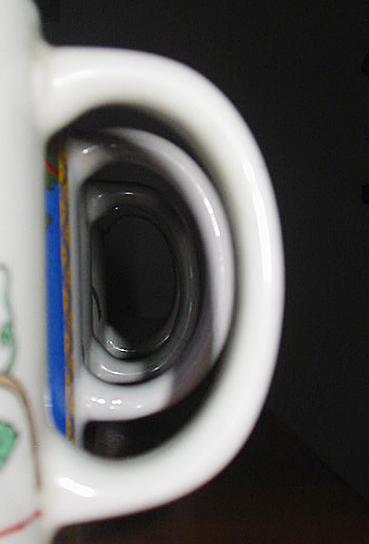
COMPOSITION
This photograph is really not say much to me. I'm sorry to say but it really looks as though it was simply put together for the challenge and not a carefully thought out and implemented photo.
As has been said before, the shadows are really distracting from the ultimate point of the photo and I think also the colours of the mugs. Perhaps it would have been more effective to use uniform mugs?
Also something just seems to be off about the whole composition - there seems to be either too much or too little black space on the right.
Your DOF also seems to be off with the first mug being blurred. IMO it would have been more effective to have the first mug in focus and have the mugs blurring as they go on.
BACKGROUND
The black background was a good idea and it adds to the image rather than distracting the viewer. As I said before though, there either seems to be too much of it or too little of it.
CAMERA WORK
The subject is not focused properly and I don't find the image to be sharp and effective.
The lighting could have been used a lot more effectively as well.
MY OPINION
I know this is beginning to sound quite harsh but I am hoping that you will take this the way it is meant - constructive criticism. Don't forget that it is only my opinion!
If I were to see an edited and redone version of this photo I would like to see better lighting to take the shadows off the handles, all of the mugs the same colour and pattern and a shift in the focus to have the first mug in focus rather than the last. |
|
Comments Made During the Challenge  |
|
|
09/20/2005 11:44:19 PM |
| nice perspective and cool idea nice lighting |
|
|
|
09/19/2005 08:24:49 PM |
| Although I wish this was more clearly in focus and maybe crop out the imprint on the first mug, I really like the creativity of your idea. |
|
 Photographer found comment helpful. Photographer found comment helpful. |
|
|
09/18/2005 10:20:57 PM |
| nice job i like that there isn't a distracting background. nice job. |
|
| Photographer found comment helpful. |
|
|
09/17/2005 08:58:36 AM |
|
| Photographer found comment helpful. |
|
|
09/16/2005 04:49:34 PM |
| Good idea. Better lighting would make this a very nice one. The shadows of the first mug, and then the second, and so on, are a bit distracting anf steal some impact from the photo. |
|
| Photographer found comment helpful. |
|
|
09/15/2005 08:08:33 PM |
| I don't like how this picture is UBER dark and kind of hazey. |
|
|
|
09/15/2005 08:33:29 AM |
|
| Photographer found comment helpful. |
|
|
09/14/2005 09:49:05 PM |
good idea but the lighting is too harsh for it to work
|
|
| Photographer found comment helpful. |
|
|
09/14/2005 08:26:02 PM |
| Interesting perspective in this photo. But while it's interesting, I don't really stay interested for a long time. And I think I would've like it more if the mugs were in more focus. But it's a nice job. |
|
| Photographer found comment helpful. |
|
|
09/14/2005 08:14:49 PM |
GO KATIE!
i like this 1 a lot
i think its you best 1
the shadow and perspective is awsome
but the blue mug sorta stands out and draws me away |
|
| Photographer found comment helpful. |
|
|
09/14/2005 06:47:41 PM |
| Creative approach and unique. I wish the shadow along handles were'nt there and even extended the mugs further and perhaps curving---cool idea tho. |
|
| Photographer found comment helpful. |
|
|
09/14/2005 12:16:50 AM |
| wish the lighting at other end had been better |
|
| Photographer found comment helpful. |
Home -
Challenges -
Community -
League -
Photos -
Cameras -
Lenses -
Learn -
Help -
Terms of Use -
Privacy -
Top ^
DPChallenge, and website content and design, Copyright © 2001-2025 Challenging Technologies, LLC.
All digital photo copyrights belong to the photographers and may not be used without permission.
Current Server Time: 04/01/2025 11:48:21 PM EDT.