| Author | Thread |
|
|
09/24/2005 11:15:02 PM |
Hello, and greetings from the Critique Club. The critique you are about to recieve is tailored for DPC challenges alone, and is not intended to be seen as an artistic critique per se.
Initial Thoughts
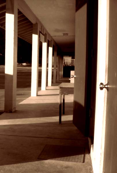
Focus is off, and the tilt doesn't really work for me. Not sure Sepia was the best choice..
Composition / Content
The composition is OK here, with the exception of the slight tilt, which isn't, in my mind, large enough to look purposeful, so gives the impression of a hurried shot. A "rule" I have heard of is that you should always use a tilt of 10 degrees or more if you're trying to do it on purpose. But eh.. math.. who needs it. The other issue I have is the open door. It's distracting, and half-covers the desk, making it more a clutter element. Also, even with the door closed, I feel the desk itself would have been almost as distracting. In a shot like this, you really want your viewer to have an unfettered line of sight down your vanishing point.
Background
A little too much going on in the background that doesn't add anything to your photo or the perspective you've chosen. This is hard, if not impossible, to to control in a situation like what you've shot in, and in an open challenge, so I wouldn't worry about it too much.. just be aware of situations like that in the future if you can.
Camera Work / Technical
For me, the lighting is a little too harsh, and I'm thinking that shooting this on a much more overcast day, or more towards evening light (or early morning light), would have helped. Your focus is also off, but that is more a factor of the aperature you've chosen and a lack of proper post-sharpening than any focusing issues on your part, I think.
Digital Processing
I personally don't feel the sepia toning here works that well. It's rather strong, and only serves to highlight the harsh contrasts of the open doorway and the poles.. which only serves to distract the viewer from your focal point and perspective. Without any information on why you chose sepia, however, I can't, and won't, bother to speculate on it.
Another thing is sharpening, this image lacks it, so work on that area as well.
Fits the Challenge
While it fits the challenge, there are many elements in this image that take the viewer's attention from it, and thus kind of ruin the effect.
My Opinion of the Photo
A nice idea, but not executed very well. The distracting elements are easily moved or taken care of.. try to avoid shooting in bright daylight with harsh shadows unless you are using that light and shadow to enhance your image or for effect.. and don't be shy about rotating a photo to get your vertical lines vertical. Keep the ideas coming, and good luck in future challenges. |
|
 Photographer found comment helpful. Photographer found comment helpful. |
Comments Made During the Challenge  |
|
|
09/20/2005 02:27:46 PM |
|
| Photographer found comment helpful. |
|
|
09/20/2005 10:39:02 AM |
| The image seems abit too blurred for my taste and could be rotated slightly towards the left. I like the sepia color tone though. |
|
| Photographer found comment helpful. |
|
|
09/17/2005 03:47:40 PM |
| I don't care too much for the overall color or lack of focus and my minds eye wants to tilt your photo slightly counter-clockwise to straighten it out. I do get some sense of perspective though. |
|
| Photographer found comment helpful. |
|
|
09/15/2005 11:01:54 PM |
| not sure if you were trying for soft but looks more like focus just a little off. |
|
| Photographer found comment helpful. |
|
|
09/15/2005 01:35:58 PM |
| this is interesting, kind of eery and makes me want to pay attention to the details, i love the black and white too.... 7 |
|
| Photographer found comment helpful. |
|
|
09/14/2005 08:19:24 PM |
| The focus is kind of bad and it's boring. |
|
| Photographer found comment helpful. |
|
|
09/14/2005 06:36:39 PM |
| Interesting capture, seems to be a bit out of focus or blurred, maybe it's my monitor |
|
| Photographer found comment helpful. |
|
|
09/14/2005 11:31:06 AM |
| A little too blurry for me. |
|
| Photographer found comment helpful. |
|
|
09/14/2005 10:55:54 AM |
| looks out of focus everywhere, sorry |
|
| Photographer found comment helpful. |
|
|
09/14/2005 10:52:36 AM |
| Really fuzzy. The highlights on the posts are also blown out. It was a difficult light requirement. Unfortunately, some cameras do not read severe light differences all that well. If you have a spot meter, squeeze the release button halfway for the camera to adjust to the best midtone light, and maybe it will equalize it better when you take your shot. |
|
| Photographer found comment helpful. |
|
|
09/14/2005 01:15:59 AM |
| Sorry...just not very interesting and could really use some focus. |
|
| Photographer found comment helpful. |
Home -
Challenges -
Community -
League -
Photos -
Cameras -
Lenses -
Learn -
Help -
Terms of Use -
Privacy -
Top ^
DPChallenge, and website content and design, Copyright © 2001-2025 Challenging Technologies, LLC.
All digital photo copyrights belong to the photographers and may not be used without permission.
Current Server Time: 03/16/2025 07:37:37 PM EDT.