<< Critique Club >>
Initial Impression:
Very flat & the colors aren't very eye-catching. Average.
Composition:
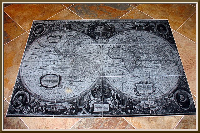
This is not a thrilling presentation. My response to it is, "Yup, there it is." The map is extraordinary, and I can tell from your comments that you wanted to share this wonderful object, but I don't get any sense of [i]your[\i] artistic vision from this photo.
Color/Tone:
The color of the background floor is not appealing to me, personally, but that's my problem. It looks like you've done a great job of capturing the true colors - there's no cast to it that I can tell.
Focus/Exposure:
Focus is excellent - exposure is fine, except for the light in the lower left hemisphere, which is a little distracting - I'm guessing that's a ceiling light? or maybe the flash?
Title:
Nice alliteration, and relates perfectly to the challenge & the subject.
Meets the Challenge:
Yes, it meets it exceptionally well.
Summary:
Like I said - average shot, mostly due to the unexciting composition. Possibly a lower angle, or from directly above it, or a tighter shot of the map would have been more interesting? |