| Author | Thread |
|
|
09/26/2005 12:33:22 AM |
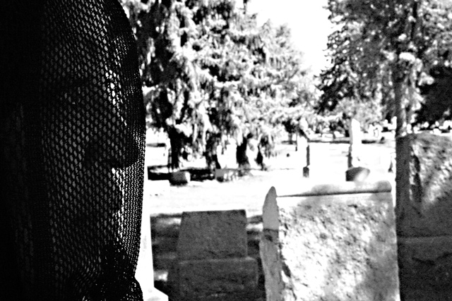
I like it. Interesting use of high contrast.
|
|
Comments Made During the Challenge  |
|
|
09/25/2005 09:30:06 PM |
| There must be a story to this picture. I look forward to reading about the point you were trying to get across. |
|
|
|
09/24/2005 09:29:48 AM |
| the background is almost too bright to know what's going on. a lot of detail is lost. |
|
|
|
09/24/2005 03:30:01 AM |
| In this particular picture, the overexposed look of the background doesn't really appeal to me. I really lost detail. Not sure I'm understanding the theme. |
|
|
|
09/23/2005 03:07:29 PM |
Desire... in a graveyard?
necrophilia?
? |
|
|
|
09/22/2005 09:04:36 PM |
| High contrast, black & white good composition...very nice. |
|
|
|
09/21/2005 10:38:29 PM |
| It took my eyes a moment to realize there was a veiled person on the left hand side. My eyes were totally taken away to the right and bright, out focused area of the photo. My first take was that she was a shadow. |
|
|
|
09/20/2005 11:50:12 PM |
I'm not sure I get it. When I look at the picture I see a cemetery and a woman in veil but the title 'Desire' doesn't really relate to that. So I'm wondering, is the background of something else than a cemetery and if so, is there any connection between the background and the title?
If it isn't, then how is one supposed to connect the title 'Desire' with a veiled woman? Does she perhaps desire freedom or love or something else? I, for one, can't sense the desire in her face though she appears to be looking at something intensily.
What, I'm basically saying is that I don't get this image - I don't understand it.
Now, IF the intention was to showcase the desire in the woman's face I think you've failed a bit. The framing of the face is nice for that but the background and the fact that her face is too dark ruin that a bit. However, if the framing of the face had been the same but the background had been much darker and the face brighter this might have been pretty neat picture. |
|
|
|
09/19/2005 06:51:15 PM |
| The background seems full of noise and the foreground lacks critical focus. A little less photochopping and I bet this could have fared much better. I would love to see the original. |
|
|
|
09/19/2005 05:02:47 PM |
| The background is to overexposed--I can't tell where she is. |
|
Home -
Challenges -
Community -
League -
Photos -
Cameras -
Lenses -
Learn -
Help -
Terms of Use -
Privacy -
Top ^
DPChallenge, and website content and design, Copyright © 2001-2025 Challenging Technologies, LLC.
All digital photo copyrights belong to the photographers and may not be used without permission.
Current Server Time: 03/14/2025 01:09:49 PM EDT.