| Author | Thread |
|
|
10/06/2005 07:18:14 PM |
*Critique Club*
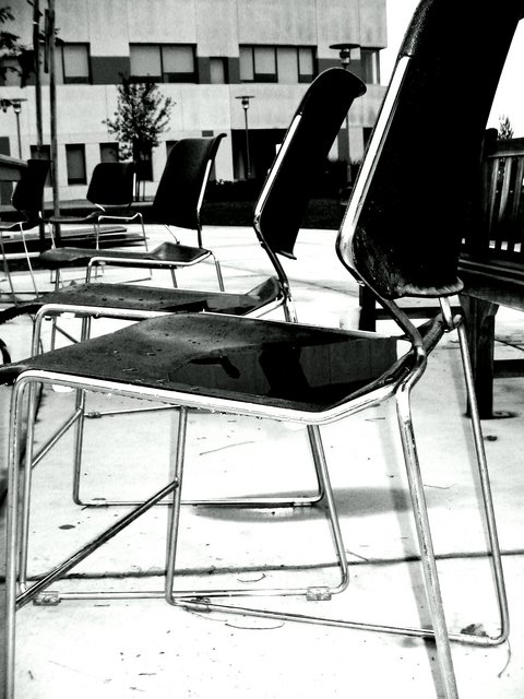
I like how the chairs turn to the right and get visually smaller and smaller and smaller. I like the black and white image. I even like the contemporary feel to it. The chairs are very modern and make a statement. Not sure if that statement is "missing you" however. The building in the background is somewhat dissracting. The picture is intersting in b&w but it does give a "cold" feeling. Not a warm and fuzzy miss you kind of vibe, ya know? Not sure if I would buy this card at a shop. Overall, I think that the picture is interesting and different, just maybe not the best choice for this challenge. Good luck in future challenges.
Mandy |
|
Comments Made During the Challenge  |
|
|
10/02/2005 06:15:37 PM |
| I like the B&W & the concept but find the picture too cluttered for my tastes. |
|
|
|
09/30/2005 10:25:40 AM |
| Interesting concept, but I feel it would have much more "punch" if you had at least one person sitting in one of the chairs. Also would suggest drying the chairs before taking the picture. As it stands , the only thing this image conveys IMHO is.... The chairs are wet and nobody wants a wet butt, that's why they're empty |
|
|
|
09/29/2005 10:07:33 PM |
| The empty chair is a nice idea for a "missing you" card. Perhaps, having a person sitting next to an empty chair might strengthen the message? Also, the bottom seems a bit overexposed. |
|
|
|
09/26/2005 03:59:18 AM |
| Heck, you're missing the whole dang group! ;) |
|
Home -
Challenges -
Community -
League -
Photos -
Cameras -
Lenses -
Learn -
Help -
Terms of Use -
Privacy -
Top ^
DPChallenge, and website content and design, Copyright © 2001-2025 Challenging Technologies, LLC.
All digital photo copyrights belong to the photographers and may not be used without permission.
Current Server Time: 03/12/2025 02:57:12 PM EDT.