| Author | Thread |
|
|
03/08/2008 10:22:28 AM |
.
Message edited by author 2008-03-08 21:30:16. |
|
 Photographer found comment helpful. Photographer found comment helpful. |
|
|
09/28/2005 01:58:50 AM |
Congratulations on your highest score. I look forward to seeing your future entries.
Judi |
|
| Photographer found comment helpful. |
Comments Made During the Challenge  |
|
|
09/27/2005 05:31:32 PM |
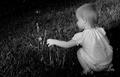
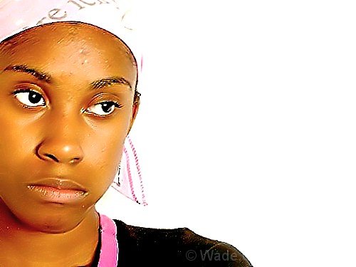
| I tried to capture something like this challenge. It did work out as well for me as it did for you. Beautiful example of the rules of thirds. |
|
| Photographer found comment helpful. |
|
|
09/25/2005 07:52:12 PM |
| Good capture of her expression. |
|
| Photographer found comment helpful. |
|
|
09/23/2005 03:32:10 PM |
| meets challenge lovely face, rather oversharpened IMO, headcovering blown out |
|
| Photographer found comment helpful. |
|
|
09/22/2005 04:36:21 PM |
| Good use of the rule of thirds, but I think the white background spoils it. There's white and there is white, and this white doesn't flatter her skintones. Also, her head loses definition because the scarf blends into the white background. |
|
| Photographer found comment helpful. |
|
|
09/22/2005 08:40:39 AM |
|
| Photographer found comment helpful. |
|
|
09/22/2005 12:31:03 AM |
| I'm drawn to the eyes, but the whole thing looks like its doubled or something. |
|
| Photographer found comment helpful. |
|
|
09/21/2005 11:19:53 PM |
Fits challenge=5
Color/lighting=1
DOF/focus=0
Wow factor/uniqueness=1
Attractiveness=1
I like this image, the direction she is looking is perfect and I like the negative space BUT her face doesn't seem as sharp as it should be. I think it had a lot of potential if it weren't for that.
Good luck |
|
| Photographer found comment helpful. |
|
|
09/21/2005 08:59:20 PM |
| I wish this was more in focus. It kinda makes me dizzy. Also, I wish the bandana was a different color from the background. |
|
| Photographer found comment helpful. |
|
|
09/21/2005 08:32:50 PM |
|
| Photographer found comment helpful. |
|
|
09/21/2005 07:49:06 PM |
| This person looks a little scary and looks like a painting but good Job |
|
| Photographer found comment helpful. |
|
|
09/21/2005 03:28:46 PM |
| I like this, but the shot seems slightly out of focus - particularly her upper face. The lighting seems a bit harsh as well. Maybe use the unsharp mask tool to sharpen up her facial features. Her expression is sort of resigned discouragement. This model has nice features. Maybe the skin tone is a touch too yellow. |
|
| Photographer found comment helpful. |
|
|
09/21/2005 02:11:36 PM |
| great color and expression. a bit too much despeckle (neat image?) for my taste. |
|
| Photographer found comment helpful. |
Home -
Challenges -
Community -
League -
Photos -
Cameras -
Lenses -
Learn -
Help -
Terms of Use -
Privacy -
Top ^
DPChallenge, and website content and design, Copyright © 2001-2025 Challenging Technologies, LLC.
All digital photo copyrights belong to the photographers and may not be used without permission.
Current Server Time: 03/12/2025 07:28:09 PM EDT.