| Author | Thread |
|
|
10/06/2005 06:45:28 PM |
*Critique Club*
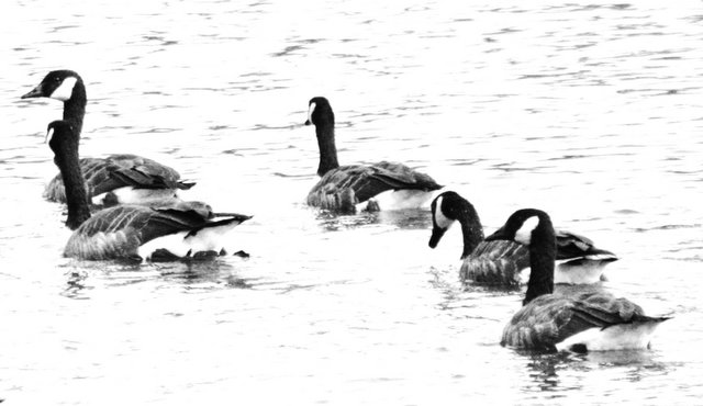
Greetings from the Critique Club! Hello my name is Mandy and I will be your critiquer today.
First I want to point out the good things. Black and White pictures are my favorite! But with this shot, I think that color would have been a better choice. I think that it is nice that all of the ducks are going in the same direction. I like how they move your eye across the photo from one corner to the opposite corner. So your cropping was good.
Now for the nick pickety stuff. High Key effects are great on SOME pictures. I think that with water photos they make the photo less intersting. Water shots can be so magical with all of the reflections and movement. Why remove that? The ducks seem to be out of focus, but that could have happened with the processing of the high contrast or when you converted to black and white.
Your subject does not fit your title. Ducks swimming does not say Missing You, IMO. Maybe if there was one duck swimming alone. Maybe if there was a mother duck and her babies behind her with a definate gap between the second to the last baby duck, a missing you theme would have been easier for the viewer to relate to. Or maybe that is just a bunch of hogwash. What do I know? I hope this was helpful and good luck in future challenges.
mandy |
|
Comments Made During the Challenge  |
|
|
09/30/2005 10:23:40 AM |
| I'm missing the reference, the highlights too blown out and the image is overall blurry. |
|
|
|
09/29/2005 09:01:59 PM |
| I think it was a nice shot, and I like the black and white, but it seems too overexposed. |
|
|
|
09/27/2005 04:11:31 PM |
| Normally I like high key, contrasty B&W shots but thsi just seems badly exposed and out of focus. |
|
|
|
09/26/2005 11:06:28 PM |
|
|
|
09/26/2005 06:11:41 PM |
| Lighting is a bit bright.The subjects are clear. I like how a few appear to be 'looking' around. |
|
|
|
09/26/2005 10:34:09 AM |
| I think there is too much glare on the water. |
|
|
|
09/26/2005 09:32:52 AM |
|
|
|
09/26/2005 09:23:53 AM |
|
Home -
Challenges -
Community -
League -
Photos -
Cameras -
Lenses -
Learn -
Help -
Terms of Use -
Privacy -
Top ^
DPChallenge, and website content and design, Copyright © 2001-2025 Challenging Technologies, LLC.
All digital photo copyrights belong to the photographers and may not be used without permission.
Current Server Time: 03/14/2025 03:37:03 PM EDT.