| Author | Thread |
Comments Made During the Challenge  |
|
|
10/02/2005 11:51:14 AM |
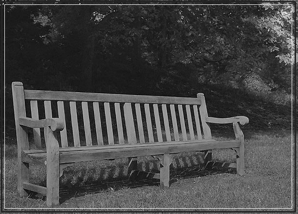
| I'd like to see a person in this shot to emphasize the title a bit more. It works as is, but adding a person never seems to hurt. Finding the right person may be difficult, but I'm sure you're up to it. |
|
 Photographer found comment helpful. Photographer found comment helpful. |
|
|
10/01/2005 11:25:07 AM |
| Sharp pic but may have had more impact in colour - too dark overall for my taste |
|
| Photographer found comment helpful. |
|
|
09/30/2005 07:22:38 PM |
| Very effective image in portraying the mood, I really like the b&W tones. |
|
| Photographer found comment helpful. |
|
|
09/30/2005 04:37:07 PM |
| Like the composition but the PP is flat. |
|
| Photographer found comment helpful. |
|
|
09/30/2005 10:59:12 AM |
| Nice capture. It's a little "low contrast" for my taste, but overall I like the composition. |
|
| Photographer found comment helpful. |
|
|
09/28/2005 11:36:47 PM |
| Very grey looking. Try adjusting the contrast some. If you have photoshop open up curves and create an S-curve. |
|
| Photographer found comment helpful. |
|
|
09/28/2005 11:28:57 AM |
| Nicely done. I think this picture could use a little boost of contrast. |
|
| Photographer found comment helpful. |
|
|
09/27/2005 09:50:00 AM |
| more contrast would make this a stronger image for me |
|
| Photographer found comment helpful. |
|
|
09/26/2005 01:09:12 PM |
| Nice picture. The long bench makes me think you could send the card to several friends at the same time :) |
|
| Photographer found comment helpful. |
|
|
09/26/2005 10:45:07 AM |
| Nice. Some people might tell you that you should have upped the contrast, but I like that lower contrast look for this. It makes it look old fashioned or something. |
|
| Photographer found comment helpful. |
Home -
Challenges -
Community -
League -
Photos -
Cameras -
Lenses -
Learn -
Help -
Terms of Use -
Privacy -
Top ^
DPChallenge, and website content and design, Copyright © 2001-2025 Challenging Technologies, LLC.
All digital photo copyrights belong to the photographers and may not be used without permission.
Current Server Time: 03/12/2025 02:51:25 AM EDT.