| Author | Thread |
|
|
09/27/2007 12:57:43 PM |
Nick, this was my first entry at dpc, and it, also, was an attempt at humour. The challenge title was Holy Places, and I titled mine Unholy places.
 It scored next to last place with 3.61. It scored next to last place with 3.61.
Voter's here aren't forgiving of bad pictures - even when humour is the point. |
|
|
|
10/03/2005 02:27:38 AM |
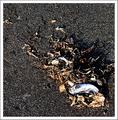
| Sorry guy's it was a bad attempt at humor. The "Get Well' was meant for the flowers. They looked pretty sad. |
|
Comments Made During the Challenge  |
|
|
10/02/2005 03:52:53 PM |
| Coorful - but a litle too dark |
|
|
|
10/01/2005 02:32:21 PM |
| The background is very dark for a "Get Well" card. |
|
|
|
09/29/2005 08:37:48 PM |
| No offense but those flowers look like they are on the way out. |
|
|
|
09/29/2005 07:08:47 AM |
A good idea, fits the challenge well. The flowers have some vivid color, but overall the exposure or lighting feels kind of off, maybe you used on board flash?
I can't tell if the background is wood, or what, but it seems a little distracting. Good focus and clarity, but overall, I find my eye struggling to find a strong point of interest in the shot. I realize the arrangement overall is the subject, but in this case, it feels lacking, and I as the viewer, am wandering, searching over the image. Perhaps there is just a little too much, too busy. Some of the flowers look kind of droopy and ill. |
|
|
|
09/27/2005 10:15:38 PM |
| This whole picture just looks so dead! The lighting seems to scream, "Sorry about your plants' loss of sunlight." |
|
|
|
09/27/2005 10:47:40 AM |
| For a get well card, the flowers look rather dismal and overall shot is rather dull. |
|
|
|
09/26/2005 07:44:58 PM |
| Rather looks like flowers on an old wooden tombstone. Nice color though but disturbing imagery for "Get Well" |
|
|
|
09/26/2005 04:17:23 PM |
| I understand the concept of giving flowers (even on a card) as a get-well-gift, but these flowers look like they've gone a few rounds with my four-year-old. On a technical note, the light from the on-camera flash is very harsh; perhaps you could soften it a bit next time by taping tissue paper or a plastic spoon over the flash. The background is very distracting - I keep trying to figure out what it is rather than simply taking in the photo. |
|
|
|
09/26/2005 02:01:47 AM |
| sadly the flowers look worse for wear... |
|
|
|
09/26/2005 01:03:58 AM |
| Shame about the dying flowers. I know you can do better then this! |
|
Home -
Challenges -
Community -
League -
Photos -
Cameras -
Lenses -
Learn -
Help -
Terms of Use -
Privacy -
Top ^
DPChallenge, and website content and design, Copyright © 2001-2025 Challenging Technologies, LLC.
All digital photo copyrights belong to the photographers and may not be used without permission.
Current Server Time: 03/13/2025 02:56:04 AM EDT.