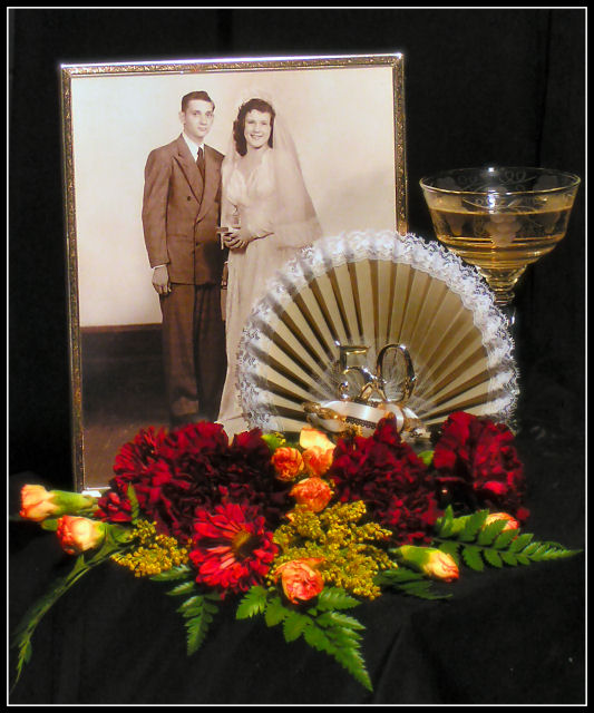
This is a photo of my parents when they were married, a piece of their stemware they received as a gift at the wedding and their cake topper when they celebrated their 50th wedding anniversary. This year would have been their 58th. My father passed away from liver cancer May 9th, 2005, 3 month before their anniversary. This is my tribute to my parents.
Statistics
Place: 114 out of 211 Avg (all users): 5.2915 Avg (commenters): 5.6667 Avg (participants): 5.0962 Avg (non-participants): 5.4622 Views since voting: 783 Views during voting: 323 Votes: 223 Comments: 6 Favorites: 0
A beautiful tribute to your parents. I know your Mom is proud and I know your Dad would be too. I remember this shot well from the challenge. I liked it a lot then too. Nice job.
I want to discuss some aspects of this shot that I think are good, some areas that I think could be improved and a bit about how the shot fits into the challenge.
First the good: I like the selection of pbjects you've chosen here, especially the wedding photo. Old photographs are wonderful little windows to the past and here the photograph is certainly the central object. The cake topper with the "50" on it makes it clear that these two were together 50 years and the flowers and stemware indicate a celebration. Even without reading your comments, your emotional connection to the subjects is clear.
Technically, the exposure seems accurate, you have a nice black background and the blown out areas are not too excessive. I also like the soft focus effect, I think you used it well and certainly didn't go overboard with it.
I'm assuming that with a shutter speed of 1/20 you used a tripod. I'm not terribly familiar with your camera, but I noticed that you used f3.5, which I'm assuming is wide open, or nearly so. I also noticed a bit of purple fringing around the brightest areas of your picture. I'd suggest that you stop down to f5.6 or so and use a longer exposure time. This picture could also benefit from some diffusion over the light source(s), that would also help with the really bright reflections and blown out areas.
The arrangement of the objects seems OK, but you might also experiment with different arrangements of the objects, maybe adding another glass (if possible). Shots like this are, almost by definition, going to appear set-up, there's not really any point in trying to avoid it, but perhaps an alternate arrangement that did not cover up the bride so much and did cover some of the empty part of the photo on the groom's side might be an improvement. She seems to be hiding behind the fan part of the cake topper and he seems to have a lot of extra space. This is really just minor and some suggestions of possibilities on my part.
As far as how this fits the challenge, I'm a bit divided. I like the image and think it would make a wonderful card/gift to the couple pictured in the photograph. That personal touch also means that it might not mean so much to another couple. Still, regardless of what the picture means to others, I can tell you have created something that has great personal meaning to you, and that's what really matters in this case.
Fit Challenge Criteria: 1/2
Contrast/Color: 1/2
Composition: 2/2
Photo Quality: 1/2
My Subjective Affinity: 1/2
This is a nice image, but it doesn't hit the spot for a greeting card. The idea is nice, and it would be a good personal gift, but not something I would buy in a store.
As for the technical aspect, I like the soft focus and the composition, but it is a little busy, and the 50 doesn't stand out quite enough.