| Author | Thread |
Comments Made During the Challenge  |
|
|
10/04/2005 03:20:21 PM |
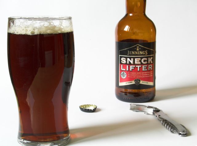
| cropping is too tight, why cut off the neck of the bottle and the bottom of the glass when you already have so much white space? Good colors and shadows. |
|
 Photographer found comment helpful. Photographer found comment helpful. |
|
|
10/02/2005 05:27:00 PM |
| I think you have a choice here in composition...a) using more negative space, therefore giving more a sense of place to the assorted objects...or b) bringing the obects closer together and doing a major crop in the lens. Right now, it seems too much halfway between, so there's nothing really holding it together. |
|
| Photographer found comment helpful. |
|
|
09/29/2005 05:09:26 PM |
| IMO the elements need to be closer together. |
|
| Photographer found comment helpful. |
|
|
09/29/2005 11:05:52 AM |
| The crop on the top of the bottle looks pretty good but I wish you hadn't cropped the bottom of the glass, it makes the whole thing look a little disproportionate. |
|
| Photographer found comment helpful. |
|
|
09/29/2005 09:20:53 AM |
| Good composition for me. I wish the glass wasn't cut off at the bottom, but I like the lighting and colors. Having the cap and opener adds interest as the photo would be boring without them. Well done and good luck in the challenge. |
|
| Photographer found comment helpful. |
|
|
09/28/2005 09:28:47 PM |
| Not too bad. 6. I think in this case the reflection in the glass hurt the composition as well as the light reflection on the bottle. Also feels like it needs to be rotated a few degrees clockwise. |
|
| Photographer found comment helpful. |
Home -
Challenges -
Community -
League -
Photos -
Cameras -
Lenses -
Learn -
Help -
Terms of Use -
Privacy -
Top ^
DPChallenge, and website content and design, Copyright © 2001-2025 Challenging Technologies, LLC.
All digital photo copyrights belong to the photographers and may not be used without permission.
Current Server Time: 04/27/2025 07:00:47 PM EDT.