| Author | Thread |
|
|
10/05/2005 12:27:48 AM |
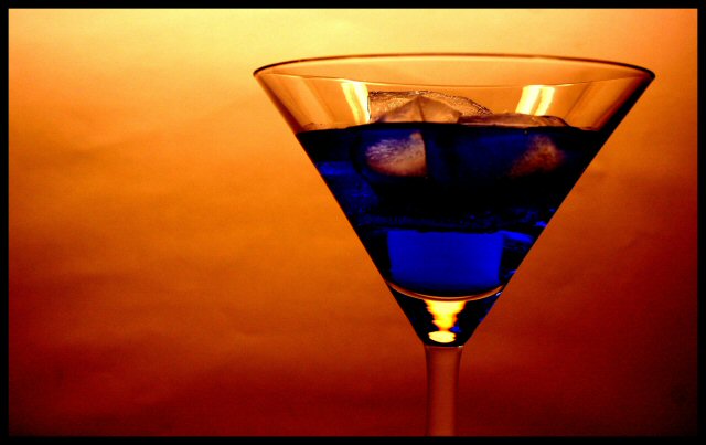
Ouch. I happened to be around for the turnover, had fifteen minutes and a hundred pics not voted on. Tried to get some votes in in the last few minutes.
This pic was the last one I voted on. I gave a comment and a 10. Didn't make it in the vote. Sorry.
I really liked this picture for a couple of reasons. Mood and Colour.
The colour is excellent. It definitely looks to me like you have used coloured paper with some wrinkles in it. I would say it's pretty likely that someone has been learning from our recent spate of colour and contrast challenges. The colour to me is strong enough to provide context for the lighting, which is very good for this shot.
Those two elements plus the wrinkles in the paper give the pic a mood. I felt it looked like a cocktail brewed up in some Mexican bar, with a somewhat patchy wall behind. I don't know if these were your intents, but that's what hit me when I first saw this pic.
My cousin grew up in Costa Rica and he told me of a bar down there that had this drink (an 8-layered tall glass affair) that if you could drink it in less than 5 minutes and walk a straight line out the door, the bar would pick up your entire tab. There's something special about those Tico drinks.
Nice job. |
|
Comments Made During the Challenge  |
|
|
10/04/2005 11:32:10 PM |
| Oh terriffic. The colour contrast just makes this stand out so strongly. Composition is also spot on - 9 for now |
|
|
|
10/04/2005 12:26:17 AM |
|
|
|
10/03/2005 11:54:24 PM |
| The color is great. Could have avoided the folds in the background. |
|
|
|
10/02/2005 06:42:33 PM |
|
|
|
10/01/2005 06:09:17 PM |
| Interesting colors. Love the shading, very crisp on the glass. |
|
|
|
09/30/2005 04:34:02 PM |
| these colors work very well together. nice composition |
|
|
|
09/29/2005 11:32:28 PM |
|
|
|
09/28/2005 09:41:27 PM |
| Stunning colors. Could have done with editing out the crinkles in the back drop but since it's not allowed, it's still a 9. Great job. |
|
|
|
09/28/2005 04:53:44 PM |
| I like the idea very much. I think if the background were further back you might have been able to soften it and avoid the imprefections from coming through. Also a little tighter focus on the glass itself might be nice. |
|
|
|
09/28/2005 07:40:05 AM |
|
|
|
09/28/2005 05:14:28 AM |
| There is no blue food in nature (somebody said drinking curasao blue) |
|
|
|
09/28/2005 12:51:34 AM |
| Nice colors. A very early fav. 8 for now...I saw a lot of good ones in the thumbnails. If we were going for a print on this and you had to get it perfect, I would have replaced the background paper with one that didn't have as many dimples. |
|
|
|
09/28/2005 12:46:39 AM |
|
Home -
Challenges -
Community -
League -
Photos -
Cameras -
Lenses -
Learn -
Help -
Terms of Use -
Privacy -
Top ^
DPChallenge, and website content and design, Copyright © 2001-2025 Challenging Technologies, LLC.
All digital photo copyrights belong to the photographers and may not be used without permission.
Current Server Time: 03/12/2025 02:18:30 AM EDT.