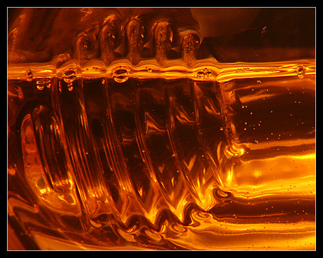
Almost skipped this challenge ... until I spotted the funky moulding on this vegetable oil bottle.
Lit by a desk lamp. +4 closeup lens. Used the 'wrong' white balance to get the golden colour. Cropped only at one end to get it into the right aspect ratio for the prints : )
Statistics
Place: 25 out of 202 Avg (all users): 5.8514 Avg (commenters): 6.7778 Avg (participants): 5.8909 Avg (non-participants): 5.8125 Views since voting: 1024 Votes: 222 Comments: 10 Favorites: 1 (view)
Preamble.
Don�t look at this as a photograph and think �What is it?�. That kind of thinking reduces photography to just a guessing game, a quiz. Rather, imagine that this was painted. How would your reaction be then?
Overall
The first impression one gets on viewing this image is the need to work out what the image actually is � an enigma, so to speak. The challenge (not in the DPC sense) therefore, is to create an image that is worthy of such investment of time and mental energy. Beyond that, if the conclusion (if such a word can be used) reveals something wonderful or vital or valuable, so much the better.
The only clues I had were the title and the image itself. Rather quickly, given that this is a �liquid� challenge, I realised that you had used some kind of oil as your base (forgive the pun). Now, I had to gauge whether or not the choice was appropriate. Certainly, there is a feeling of texture here. Your palate is lavish and your brush strokes fluent. There is intricacy, but not so much as would be inappropriate in a real oil painting. The focus is . . .
I stopped that sentence midway because, for the first time, I had realised that I was talking about a photograph, not an oil painting. My language until that point, as well as my projected thinking, was relevant to traditional art. So, in that real sense, with me, you�ve succeeded to a remarkable degree, at that level.
Artistic and Conceptual considerations
Your tonal palate is very well enhanced by the sense of light pervading the image. It is as if you took a single colour line and used every hue on it � the lights, the darks, the in-betweens, they are all beautiful and superbly balanced. I�ve a little quibble over the sharpness in the bottom left, however.
Coming to the lines themselves, the patterns are clear enough, and the contrasts effective. I particularly like the bubbles between the rising arcs. The strong line at the top 3/4 mark serves as a powerful balance to the more luxurious expanse in the bottom right. Indeed, the whole picture seems to show a movement of some contraption moving left-wards leaving a trail in the right. The space you left on the right really helps this feeling, as do the bubbles in the �track� left by the object. It�s a pity that the focus on the left wasn�t as clear as the right. If so, the sense would be complete.
There�s a problem with that. The focal plane must have been the same, meaning that the focus must be the same throughout. So, why is the left-hand side fuzzy? It�s not. Just that there are far more bits. The right-hand side is less busy, so details can stand being out-of-focus. The answer is that the whole shot is out-of-focus, only that the left shows it more. However, the focus is not really a problem, and it certainly doesn�t detract from the overall shot.
[time out]
I�ve just had a conversation about this photograph with my wife, who has a good sense for a non-photographer. Without having read the comments left during the challenge, she mimicked those who had tried to guess what the object was. I suppose that that�s one of the challenges art photographers have � people know that their subject existed in space and therefore they try to guess what it is. For me, the only difference between photographers and artists is that, whereas artists can fabricate their subject entirely from their minds, we photographers have to look around us to find subjects capable of artistic treatment. Rather than be amazed as the �beauty that is all around us in tiny aspects�, I would like others to view this kind of photography as created art as it is. Then judge it as they would any other art work.
�I don�t know about art, but I know whats I like (sic)� is a perfectly valid response to art (even though it does allow for moronic opinions). That�s the ultimate truth. One commenter (Autool � a very respected member of this community) said that he wouldn�t �want to hang it�. That�s the rub. If we choose this kind of subject, we must be open to that level of criticism.
For me? I wouldn�t hang it, either. But I would, and will, look at it again and again. For one, the sheer imagination of seeing such dynamics in a simple oil bottle is a reminder to us all that our subjects are all around us. For two, there is real dynamics in the perceived movement of the object through the �painting�. And, for three, any object which inspires real thought should be remembered. Thank you.
Unlike my normal practice in critiques, I�ve given no suggestions for improvement because art works (well executed like this one) must be judged aesthetically.
Okay -- good choice for the topic. A bit too much homogenity in shade gives it a slightly blander look than ideal, but the striations help with that some.