| Author | Thread |
|
|
11/19/2005 12:03:01 PM |
|
 Photographer found comment helpful. Photographer found comment helpful. |
|
|
11/11/2005 07:04:49 AM |
| Beautiful image. I think that I like everything about this photograph. The contrast gives it a beautiful graphic quality. Very nicely done. |
|
| Photographer found comment helpful. |
|
|
10/17/2005 08:17:16 PM |
| This photo has perfect blacks and great whites. Great job on the contrast. Has great tone and mood. I can't believe this didn't score better. |
|
| Photographer found comment helpful. |
Comments Made During the Challenge  |
|
|
10/09/2005 06:00:51 PM |
This works for me. I can see this hanging on someones wall.
Good luck |
|
| Photographer found comment helpful. |
|
|
10/09/2005 01:10:06 PM |
| like a scene out of SinCity wich i like very much! |
|
| Photographer found comment helpful. |
|
|
10/09/2005 01:26:46 AM |
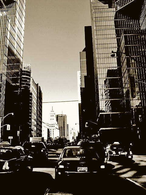
| hmmm... I'm sure you have gotten lots of complaints about the processing on this. It is not to my taste, but I do think it has it's place. It does have a good dirty feel to it. perhaps some grain would have helped make it better? I dont know. The treatment makes it look dirty, but the particular part of the city you used is very clean.6 |
|
| Photographer found comment helpful. |
|
|
10/07/2005 10:59:28 PM |
| I love this kind of image. You've made 2005 look at first glance like 1945. Or maybe 1955. The point-of-view, from behind the cars, is unusual and effective. And the high-contrast treatment is terrific for the subject. Given that it is advanced editing, and also that you have clearly post-processed the image a little to attain the terrific visual effect, I will be very interested in any comment you later make about the decision to leave the wires in. I don't object to it; I'm just surprised. 8. |
|
| Photographer found comment helpful. |
|
|
10/07/2005 07:18:13 PM |
| The tonal range looks very limited on the bottom third of this, ends up confusing the eye. Not sure I like this type of processing... Lovely sharp focus on the buildings though. Might have worked better if you'd cropped out the cars. |
|
| Photographer found comment helpful. |
|
|
10/07/2005 07:06:13 PM |
|
| Photographer found comment helpful. |
|
|
10/07/2005 03:00:59 AM |
| Interesting choice with the high contrast...I kinda dig it for this pic. Gives a very unique feel to the shot! |
|
| Photographer found comment helpful. |
|
|
10/05/2005 06:03:19 PM |
| i like the dark tones in this quite a bit. |
|
| Photographer found comment helpful. |
|
|
10/05/2005 01:11:10 PM |
| Nice effect in monochrome. Converging verticals could have been fixed. |
|
| Photographer found comment helpful. |
|
|
10/04/2005 11:35:34 AM |
| Awesome imnage treatment here. I love it. |
|
| Photographer found comment helpful. |
|
|
10/04/2005 10:24:51 AM |
|
| Photographer found comment helpful. |
|
|
10/04/2005 08:15:55 AM |
| This shot must have been difficult with deep shadow and bright sunlight. A little too bright for the distant buildings, imo |
|
| Photographer found comment helpful. |
|
|
10/03/2005 09:45:47 PM |
| Love the high key! Awesome shot! |
|
| Photographer found comment helpful. |
|
|
10/03/2005 03:23:39 PM |
| hmm... at first glance this looks like downtown toronto. *spotting ttc sign and confirming it is* :) I like the high contrast post-p which gives it a very artistic look. |
|
| Photographer found comment helpful. |
|
|
10/03/2005 11:23:09 AM |
| There are several city scapes and this is one of my favorites. I love thea gray/brown filter and the perspective of the shot. Good contrast as well. |
|
| Photographer found comment helpful. |
Home -
Challenges -
Community -
League -
Photos -
Cameras -
Lenses -
Learn -
Help -
Terms of Use -
Privacy -
Top ^
DPChallenge, and website content and design, Copyright © 2001-2025 Challenging Technologies, LLC.
All digital photo copyrights belong to the photographers and may not be used without permission.
Current Server Time: 03/11/2025 01:47:20 PM EDT.