| Author | Thread |
|
|
10/12/2005 09:44:58 AM |
| This was my favorite picture!!!! I didn't vote but I almost did when I saw this, just so I could give this a ten!! What is it doing way down here at the end. |
|
Comments Made During the Challenge  |
|
|
10/11/2005 08:00:02 AM |
|
 Photographer found comment helpful. Photographer found comment helpful. |
|
|
10/10/2005 01:19:19 PM |
| Very hip...super cool colors too...nice take on the challenge. |
|
| Photographer found comment helpful. |
|
|
10/09/2005 03:49:01 AM |
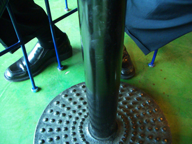
| I'll give you points for novelty, but aside from the geometry this isn't a particularly interesting shot. |
|
| Photographer found comment helpful. |
|
|
10/09/2005 03:19:06 AM |
| Out of focus, pukey colors, overblown highlights |
|
|
|
10/08/2005 10:38:10 PM |
| Interesting take on the challenge, but I don't find the subject matter holds my interest as well as other entries. Perhaps if the table itself wasn't in the middle of the photo or if there were spilled coffee by his feet, I would have scored it higher. |
|
| Photographer found comment helpful. |
|
|
10/07/2005 04:39:56 AM |
| did you take this by accident when you took the camera out of the bag ? |
|
|
|
10/06/2005 07:02:37 PM |
| Nice colours, but there is no real focus here, nothing to attract the viewers attention for more than a couple of seconds. |
|
| Photographer found comment helpful. |
|
|
10/06/2005 06:47:06 PM |
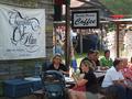
| this is one of my top 3. i give it a 10 because the colors are nice and it's one of the few unique coffee shop entries. the post is a little too centered. who cares? |
|
| Photographer found comment helpful. |
|
|
10/06/2005 09:39:56 AM |
| Nice twist. Definately a different perspective of a coffee shop |
|
| Photographer found comment helpful. |
|
|
10/06/2005 12:35:16 AM |
| a different perspective! the image has a greenish cast, possibly picked up from the floor color? |
|
| Photographer found comment helpful. |
|
|
10/06/2005 12:16:42 AM |
| This suits the challenge and isn't a pot of coffee or a mug, but overall, it isn't that interesting. I think part of the problem was the challenge category wasn't either. The color of the floor with the blue of the metal poles is good. The glare on the man's right show is a tad distracting. Also, the pole being dead in the center kind of gives it that bulls eye effect. Maybe shot from a different perspective??? |
|
| Photographer found comment helpful. |
|
|
10/05/2005 10:19:07 PM |
| I like this shot. I think it would be more powerful if the table post was offset more to the left or right. Good contrast of color, one little hot spot on the left shoe but a creative approach to this challenge. |
|
| Photographer found comment helpful. |
Home -
Challenges -
Community -
League -
Photos -
Cameras -
Lenses -
Learn -
Help -
Terms of Use -
Privacy -
Top ^
DPChallenge, and website content and design, Copyright © 2001-2025 Challenging Technologies, LLC.
All digital photo copyrights belong to the photographers and may not be used without permission.
Current Server Time: 03/11/2025 02:18:09 PM EDT.