| Author | Thread |
|
|
10/12/2005 12:52:53 AM |
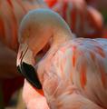
My impression - impressionistic.... highlights are hot, successful in being painterly.... colour saturation might be stronger. Frame and crop are good. This one is easy to pass over because of the softness.
Message edited by author 2005-10-12 00:57:50. |
|
 Photographer found comment helpful. Photographer found comment helpful. |
Comments Made During the Challenge  |
|
|
10/11/2005 12:14:03 AM |
| i love the texture of this picture. nice colors! |
|
| Photographer found comment helpful. |
|
|
10/09/2005 08:37:58 PM |
The comlimentary colours challenge is about
"use TWO complementary colors to compose your photograph"
This is more than 2 colours and whilst is is a fine photo, I cannot score it any higher than 3 |
|
| Photographer found comment helpful. |
|
|
10/09/2005 03:53:59 AM |
| Out of focus and overblown highlights |
|
| Photographer found comment helpful. |
|
|
10/08/2005 10:08:18 PM |
| I think your focus is off... |
|
| Photographer found comment helpful. |
|
|
10/07/2005 11:18:51 PM |
|
| Photographer found comment helpful. |
|
|
10/07/2005 05:08:12 PM |
| Where is the focal point? |
|
| Photographer found comment helpful. |
|
|
10/06/2005 06:14:00 PM |
|
| Photographer found comment helpful. |
|
|
10/05/2005 02:39:23 PM |
| I think the complementary colors should both be in focus. I also think the light is too harsh. |
|
| Photographer found comment helpful. |
|
|
10/05/2005 07:27:02 AM |
| focus appears to be off to me |
|
| Photographer found comment helpful. |
|
|
10/05/2005 01:26:42 AM |
| Now lets see: 1 2 3 4colours, doh |
|
Home -
Challenges -
Community -
League -
Photos -
Cameras -
Lenses -
Learn -
Help -
Terms of Use -
Privacy -
Top ^
DPChallenge, and website content and design, Copyright © 2001-2025 Challenging Technologies, LLC.
All digital photo copyrights belong to the photographers and may not be used without permission.
Current Server Time: 03/12/2025 03:20:09 PM EDT.