| Author | Thread |
Comments Made During the Challenge  |
|
|
10/11/2005 11:37:38 PM |
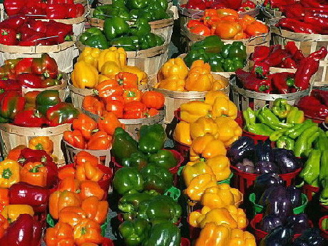
| Nice picture but not exactly focued on two complementary colors. |
|
|
|
10/11/2005 09:53:49 PM |
| The colors are beautiful. |
|
|
|
10/11/2005 06:01:28 PM |
| seems a little grainy to me, high ISO???? |
|
|
|
10/11/2005 11:40:00 AM |
| Beautiful setting. I love the way the colors are arranged and play here. Definitiely full of contrast and complements! There are a few things that detract from the success of this picture, however. It feels tilted, perhaps cropping could level it? The lighting throws harsh highligts--if you have a polarizing filter it might help pull those down a bit so the emphasis would be on the peppers. The image seems pixelated--maybe a factor of oversharpening or just having a low-resolution image to work with--but those jaggy lines draw attention. Overall, a good eye for color and form, just a little more work on the technicalities and you'd have a very pleasing image here. |
|
 Photographer found comment helpful. Photographer found comment helpful. |
|
|
10/10/2005 08:34:02 AM |
| Wonderful wide shot of the peppers, but there are too many reds, oranges and yellows here to allow you to demonstrate complementary pairs of colours. Perhaps a closer shot of just the red and green peppers would have been more successful? |
|
|
|
10/09/2005 09:03:01 PM |
| you should have made the complimentary colors more DEFINED. |
|
|
|
10/09/2005 08:27:57 PM |
|
| Photographer found comment helpful. |
|
|
10/09/2005 09:43:22 AM |
|
| Photographer found comment helpful. |
|
|
10/08/2005 04:48:23 AM |
| There seems to be some very odd pixelation on this shot. Maybe it's the smaller size? I like the abstract feel to it but I think for this challenge there may be too many colors. I would have tried to zoom in a little more on just a couple selected colors. My eye also tends to wonder all over without finding a spot to settle on. The closest are the black/purple peppers. |
|
| Photographer found comment helpful. |
|
|
10/07/2005 06:59:32 AM |
| Like the colors.. but awful lot of pixelation in this one. |
|
|
|
10/06/2005 10:57:21 PM |
The comlimentary colours challenge is about
"use TWO complementary colors to compose your photograph"
This is more than 2 colours and whilst is is a fine photo, I cannot score it any higher than 3 |
|
|
|
10/06/2005 08:20:55 AM |
| looks like a mobile phone picture |
|
|
|
10/06/2005 12:25:44 AM |
| Great catch but i would have cropped the two tone peppers alone or even moved the blue ones next to the orange ones and cropped or if my monitor tricks me cropped the purple and yellow ones zoomed in a little more....Focus is shacky |
|
|
|
10/05/2005 07:46:49 PM |
|
|
|
10/05/2005 02:53:02 PM |
| To me this shot was not composed to show complementary colors. (blue/orange, red/green, yellow/purple) |
|
|
|
10/05/2005 09:14:39 AM |
| Doesn't really meet the challenge. |
|
Home -
Challenges -
Community -
League -
Photos -
Cameras -
Lenses -
Learn -
Help -
Terms of Use -
Privacy -
Top ^
DPChallenge, and website content and design, Copyright © 2001-2025 Challenging Technologies, LLC.
All digital photo copyrights belong to the photographers and may not be used without permission.
Current Server Time: 04/26/2025 09:02:53 AM EDT.