| Author | Thread |
Comments Made During the Challenge  |
|
|
10/09/2005 09:55:14 PM |
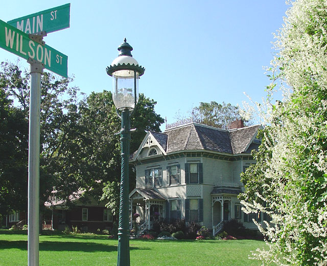
| Colours looks a bit washed out. |
|
 Photographer found comment helpful. Photographer found comment helpful. |
|
|
10/09/2005 08:12:27 AM |
| Really good idea here. Coupld of things- the streetlight and street signs are clashing for dominence. Both together clutter up the composition. I'd try shooting from the other side of the street sign and crop out the street light. Ignoring the light for a moment, the bushes and street sign make for an interesting frame. The other issue here is the light. Shot midday, the light is harsh and flattens out the scene. Try reshooting earlier or later in the day. |
|
| Photographer found comment helpful. |
|
|
10/05/2005 02:34:52 PM |
| great composition...it fits the them well...nice house !! |
|
| Photographer found comment helpful. |
|
|
10/04/2005 10:33:08 PM |
| Love this scene (and the house). Right on the nose for the challenge. My only comment is that the image is somewhat over exposed. Polarizer mugt have added to the saturation. BOL 6 |
|
| Photographer found comment helpful. |
|
|
10/04/2005 09:46:07 AM |
| It appears that the image is alittle over exposed (too me). I like the house, not real sure about the sign and the pole though. |
|
| Photographer found comment helpful. |
|
|
10/03/2005 02:33:32 PM |
| Too many elements in this photo, confuses the eye. |
|
| Photographer found comment helpful. |
|
|
10/03/2005 10:58:03 AM |
| Cool perspective - I think this picture might have been better served taken at dusk or dawn. The white flowers on the right tend to blow out the pic for me. other than that well done. |
|
| Photographer found comment helpful. |
|
|
10/03/2005 01:55:45 AM |
| looks just a little flat. I always have to go back after reducing the size and up the contrast a little |
|
| Photographer found comment helpful. |
|
|
10/03/2005 01:46:50 AM |
| it fits the challenge and it's a lovely composition. |
|
| Photographer found comment helpful. |
Home -
Challenges -
Community -
League -
Photos -
Cameras -
Lenses -
Learn -
Help -
Terms of Use -
Privacy -
Top ^
DPChallenge, and website content and design, Copyright © 2001-2025 Challenging Technologies, LLC.
All digital photo copyrights belong to the photographers and may not be used without permission.
Current Server Time: 04/11/2025 03:59:01 AM EDT.