| Author | Thread |
|
|
10/12/2005 02:39:49 AM |
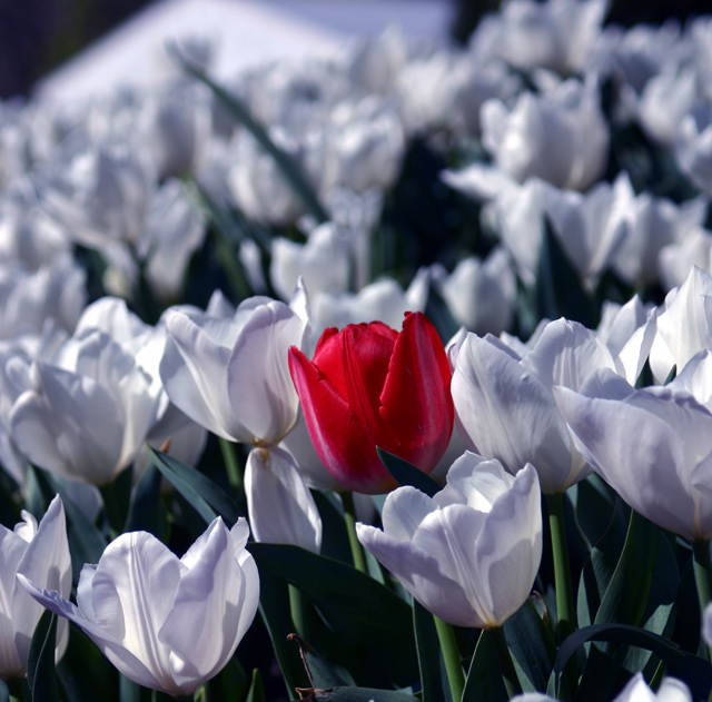
Thanks all for the comments, I realise now that this was not meeting the challenge as put out there. The real pain is the fact that I had a few other photos from the same day which would have met the challenge much better, oh well yo live and learn.
The photo was taken at the yearly Bowral Tulip festival in Australia. It wasn't set up (not by me at least) there were a few beds of flowers which had a rogue colour amongst them. Onward and upward to the next challenge. |
|
Comments Made During the Challenge  |
|
|
10/09/2005 10:35:37 PM |
| Original picture! Cropping just above the half way point would help cut out the lack of dof and make this a more interesting composition. Very nice. |
|
 Photographer found comment helpful. Photographer found comment helpful. |
|
|
10/08/2005 06:08:03 PM |
| Not really complementary colours. |
|
|
|
10/08/2005 12:58:05 PM |
| Neat - original to theme - something you'd see in greeting cards ie love that stands out or friendship. |
|
| Photographer found comment helpful. |
|
|
10/08/2005 10:55:04 AM |
| This is my highest rated picture from those I felt didn't quite emphasize complimentary colors. There is green in there but the focus in clearly on the juxtaposition of the red bulb to white bulbs. Beautiful composition. |
|
| Photographer found comment helpful. |
|
|
10/07/2005 12:44:40 PM |
| this is beautiful, but doesn't meet the challenge. |
|
|
|
10/07/2005 04:28:45 AM |
| Nice contrast, but not complementary colours. A good picture though. |
|
|
|
10/06/2005 11:23:55 PM |
| The image is very pretty and I like the DOF here. I wish the green had a little stronger presence to really showcase the complimentary color theme |
|
| Photographer found comment helpful. |
|
|
10/06/2005 10:35:17 PM |
| The foreground flowers have a nice sharp feel and the ones in background are blurred just the right amount,. Would have liked to see the top area with the big white clump cropped out of the image. Overall this is very good and should makle the top ten if not the top 5. Congrats. |
|
| Photographer found comment helpful. |
|
|
10/06/2005 10:06:01 PM |
| Not complementary colors, unless you count the green stems....which I don't partially because they are too close to being gray. |
|
| Photographer found comment helpful. |
|
|
10/06/2005 10:18:47 AM |
| IMO it would have been more effective if at least the top of the photo had been cropped and maybe one side so as to de-center the red tulip. |
|
| Photographer found comment helpful. |
|
|
10/05/2005 09:23:21 PM |
VERY nice, I think this may be one of the best in the challenge. I really like the depth of view, and the vivid color of the red flower.
|
|
| Photographer found comment helpful. |
|
|
10/05/2005 02:29:20 PM |
| I like this shot but the colors are not complementary. |
|
| Photographer found comment helpful. |
|
|
10/05/2005 12:35:30 PM |
| interesting was it growing this way or setup for photo? |
|
| Photographer found comment helpful. |
|
|
10/05/2005 05:37:49 AM |
|
| Photographer found comment helpful. |
|
|
10/05/2005 01:31:09 AM |
| I see a blue cast to this photo that's really hampering its impact. |
|
| Photographer found comment helpful. |
|
|
10/05/2005 01:04:41 AM |
|
| Photographer found comment helpful. |
Home -
Challenges -
Community -
League -
Photos -
Cameras -
Lenses -
Learn -
Help -
Terms of Use -
Privacy -
Top ^
DPChallenge, and website content and design, Copyright © 2001-2025 Challenging Technologies, LLC.
All digital photo copyrights belong to the photographers and may not be used without permission.
Current Server Time: 03/12/2025 07:52:33 AM EDT.