| Author | Thread |
Comments Made During the Challenge  |
|
|
10/11/2005 04:45:37 AM |
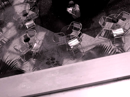
| the space that the ledge took in this picture is too big... |
|
|
|
10/10/2005 11:16:16 PM |
| The large chunk of visible windowsill is a problem. Too much of snapshot. |
|
|
|
10/09/2005 04:34:06 PM |
| The ledge needs to be trimmed a bit. Good idea though. |
|
|
|
10/08/2005 11:06:04 PM |
The angled railing in the foreground adds compositional interest, but I think that too much space was given to it and not quite enough to the waiter; his head is uncomfortably close to the edge of the frame.
|
|
|
|
10/08/2005 10:43:22 PM |
| For me, had more of the foreground been cropped out I would have scored this better. I like your angle and concept though. |
|
|
|
10/08/2005 07:23:39 AM |
| Not a bad idea but I would have liked this more if the vertical line (I guess it´s a railing) were lower in the frame and the whole shot was brighter, the whole section where the waiter is is very dark and it´s very hard to make out any details. 4 from me. |
|
|
|
10/07/2005 10:06:21 PM |
| Nice concept, this image would benefit from being rotated and then cropping out the railing(?) in the foreground. |
|
|
|
10/07/2005 09:23:50 PM |
| The diagonal line at the bottom is really distracting. I think this would have been a better image if you had focused entirely on the scene of tables and chairs. |
|
|
|
10/07/2005 10:34:02 AM |
| Don't like the bottom part. |
|
|
|
10/06/2005 04:26:01 PM |
| nice idea for your submission. when i look at this picture, it looks like some person reading a paper more than a waiter, imo. i like the angle of the shot, and the color treatment works with it. i would be interested in seeing a closer shot of the person in the shadow with the table. the guy standing in shadow with the white paper really pops out, and focusing in on him without all the empty tables could be interesting... |
|
|
|
10/06/2005 03:16:48 PM |
| Nice concept. I would have liked to see a few ciustomers though. |
|
|
|
10/06/2005 09:34:47 AM |
| Interesting angle. I would crop the roofline at the bottom though. Its pretty distracting. |
|
|
|
10/06/2005 12:31:11 AM |
| THis has interesting perspective. It just lacks a true focal point. Maybe a single person sitting with a cup of coffee would've worked better. |
|
|
|
10/05/2005 01:57:44 AM |
| IMO, a stronger image if foreground rail/wall could be cropped out and person looking at book moved more into the pic |
|
 Photographer found comment helpful. Photographer found comment helpful. |
Home -
Challenges -
Community -
League -
Photos -
Cameras -
Lenses -
Learn -
Help -
Terms of Use -
Privacy -
Top ^
DPChallenge, and website content and design, Copyright © 2001-2025 Challenging Technologies, LLC.
All digital photo copyrights belong to the photographers and may not be used without permission.
Current Server Time: 03/13/2025 05:32:28 AM EDT.