| Author | Thread |
Comments Made During the Challenge  |
|
|
10/08/2005 10:53:59 PM |
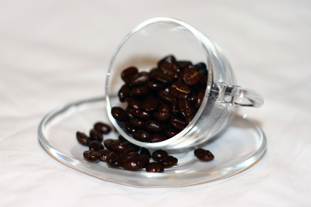
| I like your idea and the composition isn't too bad. Perhaps even keeping it a bit more off centered work help? Also, the lighting seems a bit bright to me, and if it was a bit more in focus all around (I like sharp pictures) I would have scored it better. |
|
 Photographer found comment helpful. Photographer found comment helpful. |
|
|
10/08/2005 03:25:31 PM |
| One of the best coffeecups posted. The depth of field could have been better and also the focus. |
|
| Photographer found comment helpful. |
|
|
10/07/2005 12:29:53 AM |
| I think a greater depth-of-field might have helped this shot. |
|
| Photographer found comment helpful. |
|
|
10/06/2005 09:54:07 PM |
| Meets the challenge, and does so in an artistic fashion. Enough to bump you ahead of the crowd, but to take top 10 I think you're going to need something captivating that holds the attention of the onlooker and draws interest. |
|
| Photographer found comment helpful. |
|
|
10/06/2005 04:13:00 PM |
| IMO the beans should be more in focus. |
|
| Photographer found comment helpful. |
|
|
10/06/2005 03:20:53 PM |
| The beans are too dark and not in focus, otherwise this would have been a good shot. |
|
| Photographer found comment helpful. |
|
|
10/06/2005 02:31:58 PM |
|
|
|
10/06/2005 01:42:24 AM |
| not good focus, sometimes when reducing to work here needs just a little more. load it up then look at it. |
|
| Photographer found comment helpful. |
|
|
10/06/2005 01:21:30 AM |
|
|
|
10/06/2005 12:51:45 AM |
| nice color in the beans. nice cup arrangement. complimentary lighting. the clear cup gets lost against the white background, imo. i would be interested in seeing this image with a different colored background to enhance both the cup and the beans. |
|
| Photographer found comment helpful. |
|
|
10/05/2005 06:13:26 PM |
| the contrast is too high and the beans are just too dark nice try though |
|
| Photographer found comment helpful. |
|
|
10/05/2005 03:06:51 PM |
| This is quite centred and the depth of field is just too shallow |
|
| Photographer found comment helpful. |
|
|
10/05/2005 08:40:07 AM |
| Needed to be more focused. If you lit from overhead, it might have been better to use diffused lighting by bouncing off of a white card. |
|
| Photographer found comment helpful. |
|
|
10/05/2005 03:55:42 AM |
| Nice concept, seems very centered, rule of thirds may have helped more |
|
| Photographer found comment helpful. |
Home -
Challenges -
Community -
League -
Photos -
Cameras -
Lenses -
Learn -
Help -
Terms of Use -
Privacy -
Top ^
DPChallenge, and website content and design, Copyright © 2001-2025 Challenging Technologies, LLC.
All digital photo copyrights belong to the photographers and may not be used without permission.
Current Server Time: 03/12/2025 01:38:28 PM EDT.