| Author | Thread |
Comments Made During the Challenge  |
|
|
10/11/2005 06:47:43 PM |
| Ok. for the family album....but I don't see the colors you're referring to in this image. Perhaps an even more limited depth of field would help blur the distraction of the background? |
|
|
|
10/11/2005 03:20:38 PM |
| I find the busy bg takes away from the main subject here! |
|
|
|
10/10/2005 08:03:44 AM |
Complementary colours are pairs of colours that contrast strongly when compared to each other.
The colours in this photo are so desaturated that the effect of complementary colours is lost. Your image demonstrates a duotone effect rather than the effect of complementary colours.
Check some of the forum discussions on complementary colours for suggestions on using colour for contrast.
|
|
|
|
10/09/2005 09:03:40 PM |
| those arent complimentary colors. |
|
|
|
10/07/2005 02:24:54 PM |
| Too many colours, no complementary colours. |
|
|
|
10/06/2005 10:12:44 PM |
| All the colors in this photo are rather boring to me. Which makes the whole photo a bit boring. |
|
|
|
10/05/2005 03:03:47 PM |
| I think this could have worked if there were more blue vs. gray. Good idea though! |
|
 Photographer found comment helpful. Photographer found comment helpful. |
|
|
10/05/2005 11:25:05 AM |
| Interesting shot, but I'm really missing the complementary colors |
|
| Photographer found comment helpful. |
|
|
10/05/2005 09:23:44 AM |
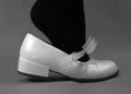
| Interesting picture. Love the outfit. |
|
| Photographer found comment helpful. |
Home -
Challenges -
Community -
League -
Photos -
Cameras -
Lenses -
Learn -
Help -
Terms of Use -
Privacy -
Top ^
DPChallenge, and website content and design, Copyright © 2001-2025 Challenging Technologies, LLC.
All digital photo copyrights belong to the photographers and may not be used without permission.
Current Server Time: 03/12/2025 03:05:46 AM EDT.