| Author | Thread |
Comments Made During the Challenge  |
|
|
10/11/2005 02:26:10 AM |
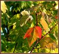
| good use of colour. Lovely clear shot. |
|
 Photographer found comment helpful. Photographer found comment helpful. |
|
|
10/07/2005 05:38:13 PM |
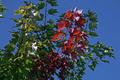
| I'm sure I'm not the first to say this but red and green are comlementary colors. That said this is a nice shot, great composition. A little soft in color and focus. |
|
| Photographer found comment helpful. |
|
|
10/07/2005 05:05:21 PM |
| The colors seem a little off? |
|
| Photographer found comment helpful. |
|
|
10/05/2005 02:16:41 PM |
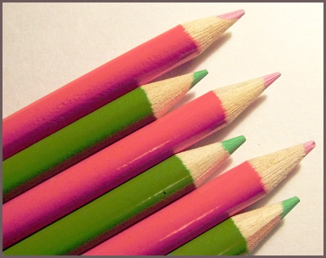
| With this image, you take me out of the limitation of red and green in the strictest sense. The pastels are refreshing, and I lile the angle of the pencils. |
|
| Photographer found comment helpful. |
|
|
10/05/2005 08:09:35 AM |
My sorority colors!! LOL
I love the idea of this. I like the up and down sense of the pencil points. IT seems slightly out of focus to me. Perhaps on a pure white background, they might've had just a bit more pop. You could achieve that with basic editing by doing a selective color adjustment (white) and using the slide tool to remove all of the other colosr that dirty it up a bit. Good composition and lighting. |
|
| Photographer found comment helpful. |
Home -
Challenges -
Community -
League -
Photos -
Cameras -
Lenses -
Learn -
Help -
Terms of Use -
Privacy -
Top ^
DPChallenge, and website content and design, Copyright © 2001-2025 Challenging Technologies, LLC.
All digital photo copyrights belong to the photographers and may not be used without permission.
Current Server Time: 03/13/2025 05:51:39 AM EDT.