| Author | Thread |
Comments Made During the Challenge  |
|
|
06/17/2003 06:58:32 AM |
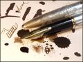
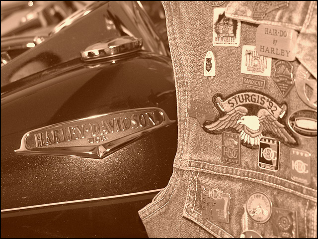
| Nice textures and interesting combo of materials and metal objects. Don't like sepia choice - seems too "Little House on the Prairie" for the sunject matter chosen. |
|
 Photographer found comment helpful. Photographer found comment helpful. |
|
|
06/14/2003 01:07:44 PM |
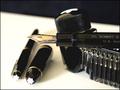
| This is a nice shot, overall, but I have trouble envisioning where magazine text would go other than in a neutral frame, if one were placed around it. The contrast between the smooth/sleek bike and the patterns and crowded feel of the patches to the right is really nice and works well, though. |
|
| Photographer found comment helpful. |
|
|
06/13/2003 04:35:30 PM |
|
|
|
06/13/2003 04:13:40 PM |
| Cool shot. Tough to crop for magazine though. |
|
| Photographer found comment helpful. |
|
|
06/12/2003 09:58:07 PM |
| Very creative idea to use sepia for this image. Technically very good and good eye appeal also! |
|
| Photographer found comment helpful. |
|
|
06/12/2003 04:23:45 PM |
| Nice shot. It captures the spirit of the magazine very well. The sepia tones work with this shot to give it an aged look. |
|
| Photographer found comment helpful. |
|
|
06/11/2003 02:29:07 AM |
| Very nice shot, I love the colors and how much there is to look at. 9. |
|
| Photographer found comment helpful. |
|
|
06/11/2003 01:32:00 AM |
| Very nice, but there seems to be a need for a bit more contrast on the jacket. 6 |
|
| Photographer found comment helpful. |
Home -
Challenges -
Community -
League -
Photos -
Cameras -
Lenses -
Learn -
Help -
Terms of Use -
Privacy -
Top ^
DPChallenge, and website content and design, Copyright © 2001-2025 Challenging Technologies, LLC.
All digital photo copyrights belong to the photographers and may not be used without permission.
Current Server Time: 04/26/2025 07:32:28 PM EDT.