| Author | Thread |
Comments Made During the Challenge  |
|
|
06/17/2003 11:23:45 PM |
| I think that there is too much contrast between the inner walls and everything flaring outside..... my attention is drawn to the background.... Good idea and balance of colours and sizes.. |
|
 Photographer found comment helpful. Photographer found comment helpful. |
|
|
06/17/2003 06:59:26 PM |
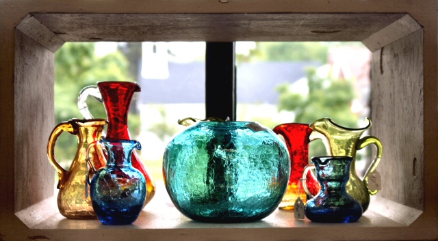
| This photo looks like a water color with the sharp translucent colors of the bottles and the Money like backgroup. I like the use of the window frame as a frame for the photo and the composition of the color with the blue flowing through the bottles. |
|
| Photographer found comment helpful. |
|
|
06/17/2003 06:37:59 PM |
| The only problem I have with this photo is that it's not cover-shaped... :) |
|
| Photographer found comment helpful. |
|
|
06/17/2003 12:15:57 PM |
| Beautfiul Colors and Lighting |
|
| Photographer found comment helpful. |
|
|
06/17/2003 05:49:15 AM |
| I love this photo. The color and composition are just beautiful. 10 |
|
| Photographer found comment helpful. |
|
|
06/17/2003 04:02:40 AM |
| Questionable orientation. |
|
| Photographer found comment helpful. |
|
|
06/15/2003 03:57:43 PM |
Personally I do not consider magazines to be in a horizontal shape... thats just me though. This is very pretty how you put it in front of the window kind of lightingup the glass. This might have been a cool picture for the glass challenge. I like the photo, as just that a photo, I don't think it would work as the cover of a magazine for various reasons, including the shape of the photograph, and I couldn't imagine how it would ever fit a vertical page. Although I like the photo I have to count down for my belief that it doesn't really fit the challenge. Sorry
|
|
| Photographer found comment helpful. |
|
|
06/14/2003 11:55:54 AM |
| I'd like to try draping some sheer fabric over the back of the opening there so soften/darken the backlighting a little. |
|
| Photographer found comment helpful. |
|
|
06/14/2003 07:07:42 AM |
| You have made good use of a natural frame. Unfortunately your subjects are a little out of focus. |
|
| Photographer found comment helpful. |
|
|
06/13/2003 01:15:50 AM |
| Wow, you know it's really nice but it doesn't convey magazine to me at all because it's LANDSCAPE orientation! Did you think of this? |
|
| Photographer found comment helpful. |
|
|
06/12/2003 12:18:17 AM |
| love the light from behind. the color is great. i wish the shape of the image was more in the shape of a magazine. nice image. |
|
| Photographer found comment helpful. |
|
|
06/11/2003 11:26:21 AM |
| IMO composition is not pretty well, it looks more like a snapshot. = 4 |
|
| Photographer found comment helpful. |
Home -
Challenges -
Community -
League -
Photos -
Cameras -
Lenses -
Learn -
Help -
Terms of Use -
Privacy -
Top ^
DPChallenge, and website content and design, Copyright © 2001-2025 Challenging Technologies, LLC.
All digital photo copyrights belong to the photographers and may not be used without permission.
Current Server Time: 03/14/2025 09:24:14 AM EDT.