The top of a pumpkin at the local pumpkin patch. It kept looking at me!
After Challenge note: Well, folks, I thought an eye in the middle of a twig was personification. Especially when the eye even had its own built in highlight. Obviously, I was wrong, but it was a fun shoot.
Statistics
Place: 115 out of 204 Avg (all users): 4.7298 Avg (commenters): 5.2500 Avg (participants): 4.4111 Avg (non-participants): 4.8769 Views since voting: 895 Views during voting: 477 Votes: 285 Comments: 6 Favorites: 0
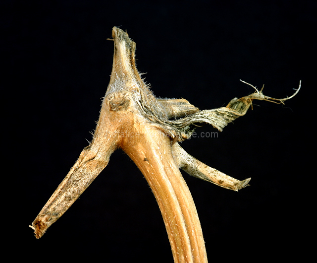
My first impression when I look at this photo: "What is that, and what does it have to do with personification?"
Relation to the Challenge: This is the biggest problem with this photo for me. Of course there are different definitions of �personification,� but the one listed in the challenge details was to photograph something that �shows human characteristics" (emphasis mine). Personally, when I look this photo, it looks more like an animal: a horse, or a sea-horse, or something. I would have voted this picture down a bit for that reason. Also, as I alluded in my �first impression,� it takes a minute to get the picture.
Composition: This photo is well composed. It follows the normal �laws� of composition, and the �eye� is square on one of the Rule of Thirds intersections. Also, the strong lines of the different stems lead the eye cleanly around the picture.
Background: The plain black background is perfect for this picture. Since there�s important detail in the subject, any background would have distracted the viewer; your choice of plain black prevents that from happening. Great choice here.
Photographic Technique: The lighting is very good. It is at just the right level, it is even, and consistent. The shot is sharp and well focused. Good use of depth of field. I like how the spiral piece of the stem on the right fades out of focus. A minor nit to pick is that the �nose� in the foreground (bottom left) also fades out of focus, where I think it should stay in focus through its entire length. That�s a minor nit though, and I wouldn�t have detracted from your score for it.
Post-Processing: Also well done. Not over sharpened, not over saturated, just right. You didn�t do anything excessive, and it shows.
Overall Opinion: You have captured a neat image, but it�s a bit like the woman who sees the Virgin Mary in a slice of toast� you�ve got to stretch a bit to make it work. Without the link through the title, I wouldn�t ever think of personification when I look at this photo. A photo that stands on its own, without needing the title to provide the link, is always going to be a stronger photo that scores better. You scored as well as you did on the technical merit, which is very strong, but it�s not a totally appropriate photo for the challenge.
Finally, I'd like to ask you to consider critiquing the critique. :) Just as you're here to learn about photography, I'd like to learn about giving better critiques. If you have any comments, even if it's just "Thanks!" please drop me a PM.