| Author | Thread |
Comments Made During the Challenge  |
|
|
10/18/2005 06:09:13 PM |
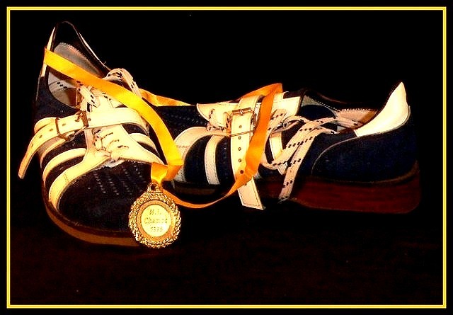
| Nice light and feel about it. True pride, pity about the flare on the medal |
|
 Photographer found comment helpful. Photographer found comment helpful. |
|
|
10/18/2005 05:05:47 PM |
| Nice composition and strong contrast. |
|
| Photographer found comment helpful. |
|
|
10/18/2005 01:04:25 PM |
| hot spot of medal is distracting. I like the composition though. |
|
| Photographer found comment helpful. |
|
|
10/16/2005 03:26:27 PM |
| Nice composition, but a little dark from the shoes to the background |
|
| Photographer found comment helpful. |
|
|
10/15/2005 06:36:56 PM |
Pride in a still life, a difficult abstraction captured exceptionally well.
2nd look- Only the distracting border keeps me from giving ti a 10. |
|
| Photographer found comment helpful. |
|
|
10/15/2005 10:24:00 AM |
|
| Photographer found comment helpful. |
|
|
10/14/2005 11:50:02 AM |
| nicely composed, wish i could read the enscription on the medal more easily. |
|
| Photographer found comment helpful. |
|
|
10/14/2005 09:19:18 AM |
| The negative space is good. The placement of the shoes is as if you just took them off, threw the ribbon on the ground and went to grab a Gator Aid. The lighting off of the medal is a bit harsh. I think the yellow of the frame, although it ties into the other coloration, is a bit too much. Maybe a creamy off white like the stripe of the shoe would have worked better. The focus doesn't seem quite as tack sharp as I'd like to see. 6 |
|
| Photographer found comment helpful. |
|
|
10/13/2005 10:45:10 PM |
| I really like this image, and the boder works for me. I know most don't seem to like them. wish for the highlight on the medal to not have remove most of what I assume is the P on champs. Probably looks fine at a larger size? good stuff. |
|
| Photographer found comment helpful. |
Home -
Challenges -
Community -
League -
Photos -
Cameras -
Lenses -
Learn -
Help -
Terms of Use -
Privacy -
Top ^
DPChallenge, and website content and design, Copyright © 2001-2025 Challenging Technologies, LLC.
All digital photo copyrights belong to the photographers and may not be used without permission.
Current Server Time: 03/12/2025 01:17:50 PM EDT.