| Author | Thread |
|
|
10/25/2005 11:35:10 PM |
*Critique Club*
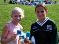
Good shot for the challenge, it defiantly fits into the pride category. I really think that your border emphasized the photo but took away from the attractiveness of your shot. Something about the border is just a tad to bold for a shot that does not contain colors that strong. Also within the image itself the colors appear to be un-natural. I might have even tried this shot in black and white just to see the contrast so the voter could focus on the subjects. I do think without the border you would have scored higher. It is very nice that you were bold enough to post the image, I think a lot people may not have been so. |
|
 Photographer found comment helpful. Photographer found comment helpful. |
Comments Made During the Challenge  |
|
|
10/18/2005 09:56:27 AM |
| whites or blue look off in color to me |
|
| Photographer found comment helpful. |
|
|
10/16/2005 10:53:34 PM |
|
| Photographer found comment helpful. |
|
|
10/12/2005 09:32:43 PM |
| border is way too distracting. |
|
| Photographer found comment helpful. |
|
|
10/12/2005 03:13:25 PM |
| I will risk being Politically Incorrect, but this shot is just too political to me, especially the border. It just seems you are trying to make a statement or push an agenda and I am not sure this is the place to do it. I would vote higher for the picture without the border. |
|
| Photographer found comment helpful. |
|
|
10/12/2005 12:19:48 PM |
| lol.. that's a cool one! but probably overcontrasted... 4 |
|
| Photographer found comment helpful. |
|
|
10/12/2005 03:20:32 AM |
| I'm glad you found models willing to pose as lesbians for this photo. Love the message!! |
|
| Photographer found comment helpful. |
Home -
Challenges -
Community -
League -
Photos -
Cameras -
Lenses -
Learn -
Help -
Terms of Use -
Privacy -
Top ^
DPChallenge, and website content and design, Copyright © 2001-2025 Challenging Technologies, LLC.
All digital photo copyrights belong to the photographers and may not be used without permission.
Current Server Time: 04/29/2025 05:48:39 PM EDT.