| Author | Thread |
Comments Made During the Challenge  |
|
|
10/18/2005 10:28:20 PM |
| I would have cropped it more at the top. |
|
 Photographer found comment helpful. Photographer found comment helpful. |
|
|
10/18/2005 02:40:11 PM |
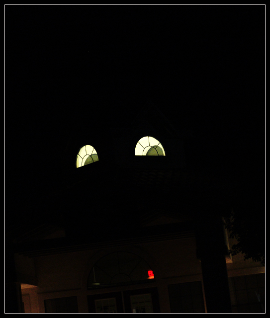
| Great shot ....IMO maybe a tighter shot of the "eyes" cropping or leaving our the Exit sign and doorways would take away the distractions. Great entry --7-- |
|
| Photographer found comment helpful. |
|
|
10/17/2005 07:08:42 PM |
|
| Photographer found comment helpful. |
|
|
10/17/2005 09:43:05 AM |
| I'd like it better with the red parts were cropped off. The eyes are great contrasted on the background. |
|
| Photographer found comment helpful. |
|
|
10/17/2005 03:35:11 AM |
| Wonderful!!! Great use of windows as eyes. I love it. 10 |
|
| Photographer found comment helpful. |
|
|
10/15/2005 10:38:53 PM |
|
| Photographer found comment helpful. |
|
|
10/15/2005 12:36:03 AM |
| weird angle and I don't like the border |
|
|
|
10/14/2005 06:23:38 PM |
| I feel this shot has way too much negative space without really adding anything to the suject. A tighter composition could have lent some substance to an otherwise somewhat static shot. I also think the red light towards the bottom is distracting. Good effort though. |
|
| Photographer found comment helpful. |
|
|
10/13/2005 10:59:50 AM |
| Very cool. Might I suggest cropping everything but the windows out. With all that room up top it gives you space to work with. The lights/objects at the bottom take away from your messge. |
|
| Photographer found comment helpful. |
|
|
10/12/2005 11:56:21 PM |
| Well spotted! Great night photography. |
|
| Photographer found comment helpful. |
|
|
10/12/2005 11:26:32 AM |
| would of scored it higher if the cropping had been better at the bottom IMO |
|
| Photographer found comment helpful. |
|
|
10/12/2005 10:24:31 AM |
| This is cool buddy, its an excellent imagination and the way it has been controlled |
|
| Photographer found comment helpful. |
|
|
10/12/2005 08:45:25 AM |
| wow you shouldve cropped out the stuff at the bottom, eyes wouldve done well on their own. |
|
| Photographer found comment helpful. |
|
|
10/12/2005 12:48:16 AM |
| thats awesome. i would have liked it if you croped it a little...or played with the brightness/contrast so the bottom stuff became invisable. |
|
| Photographer found comment helpful. |
Home -
Challenges -
Community -
League -
Photos -
Cameras -
Lenses -
Learn -
Help -
Terms of Use -
Privacy -
Top ^
DPChallenge, and website content and design, Copyright © 2001-2025 Challenging Technologies, LLC.
All digital photo copyrights belong to the photographers and may not be used without permission.
Current Server Time: 03/12/2025 07:01:38 PM EDT.