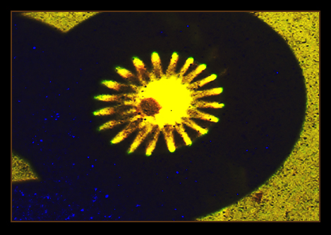
This may look like digital art, but it was quite easily made within DPC rules from a digital photo--how much more off-center can you get.
This is even a "set-up" photo, made by projecting the image of the sun through a 50-cent faceted lens onto the roof of my car, and shooting that in macro mode with Isaac's camera.
Cropped it down to the image of the sun and the shadow of the lens and my hand. Made a basic tone curve adjustment to extend the contrast range, then added a second curve which basically reverses the blue channel. Decided against sharpening at all as it really created a bad haloing problem around all the (dirt) specks.
The "Sunspot" is actually part of the projected image, and I had to maneuver the lens around to try and show it as fully round as possible and yet off-center within the bright spot.
I haven't been able to figure out how to extract all the EXIF info from these Fuji images, like from my Olympus.
Statistics
Place: 132 out of 138 Avg (all users): 4.0400 Avg (commenters): 4.2500 Avg (participants): 4.0241 Avg (non-participants): 4.0714 Views since voting: 1372 Votes: 125 Comments: 10 Favorites: 0
Oh boy, Paul, I will have to admit that I was completely flubber gusted (confused) when I saw this photo and now that it has popped up as my assignment for the critique club, I'm still pretty much flubber gusted.
I've had to study and think hard about what I'm going to say...at least to sound intelligent. Your comments helped a lot to understand your photo better, so I'm glad you included the origional and explained.
Challenge: Now that I've read your comments after the challenge and understand what I'm seeing, I can now say that you had met the criteria for the challenge. However, I also understand the confusion of the masses who voted. When looking at the image without the explaination, the eye IS drawn to the yellow starburst in the middle, not realizing that the "sunspot" is the dark splotch to the left of the starburst which, of course, is off center. Therefore, I, like many others, looked at the starburst as a whole...thus the low score, especially from those who base most of their voting on challenge critera.
Composition: Actually, this is kind of a neat picture. With the sun being in the middle and the dark circle around it, makes it look like a representation of space. I think of the starburst as the light emanating from the sun and the specks as stars in space. The yellow on the edges doesn't really go along with my idea, since I don't know what it would represent. In other words, I don't like them. So, with that in mind, I wonder if you would have cropped a little different or had even taken the picture a little differently and gotten rid of the yellow edges, you would have gotten higher scores.
Question...would you still be able to obtain the sun spot image by encircling your entire hand around the lens instead of with just your fingertips? Doing that instead would give you more dark space. Or if that wouldn't work, by croping your current image closer in and taking out the yellow edges, would you lose image quality cropping in that close. I suppose that would depend on how big your origional was at the beginning. As it stands now, it already is small. Now, if even with the changes, would people still notice the splotch as the sun spot as off-center? I don't know, but outside the challenge, I think it would be a nicer picture as an abstract.
Technical: I don't have much to comment on the technical aspects of this photo. I like the post-production changes that you made to it. The colors really made it interesting. I don't really see how you could say that it was out of focus. It looks fine to me and your origional is in focus.
Overall: I do believe that this was definately a mis-understood photo for the challenge. People focused on the starburst image as a whole, not knowing where the sunspot actually was. A well devised and unique plan for the challenge, but was lost to others seeing it and voting on it. As you know, complicated (which may not be complicated to you) images that aren't noticeably visable and easily misunderstood by others, do not do well on DPC.
I hope this all makes sense and that I was able to put words to my thoughts effectively.
Keep up the good work, Paul and good luck in future challenges. You have been submitting on the site for a long time and I always look forward to what you come out with. Your pictures are usually always unique and fun to study.
Here's a link to the original from which I created my entry. The off-center subject is the dark spot on the projected image of the sun, just like the title says ....
Even though the overall shape is off-center, my eyes are drawn to the middle yellow shape, in the center - so I'm having trouble thinking of this photo as "off center". It also looks a bit out of focus.