| Author | Thread |
Comments Made During the Challenge  |
|
|
06/17/2003 01:33:10 AM |
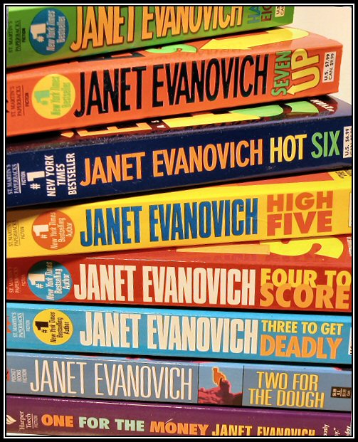
| Funny - so many NYT bestsellers I've never heard of! Good composition, not fond of the contrast. The colors seem bleached out. |
|
|
|
06/16/2003 01:34:01 PM |
| this has a comic book feel to it from the colours of all these softcovers. I don't know this author, but I'm guessing these are popular books! I think the frame is a little too full for a magazine cover. |
|
|
|
06/13/2003 01:57:48 AM |
| Huh? Who is Janet Evanovich? LOL, really off the wall. |
|
|
|
06/11/2003 05:09:39 PM |
| Interesting idea... I think it works, though it bothers me how the top left corner starts to get blurry. Otherwise I think it is a simple idea that could possibly be used for a magazine cover. |
|
 Photographer found comment helpful. Photographer found comment helpful. |
|
|
06/11/2003 03:13:38 AM |
|
| Photographer found comment helpful. |
|
|
06/11/2003 03:05:40 AM |
| I dont think having so much "words" on a magazine cover is good. the magazine's title could just get itself hidden like a needle in a haystack. 6 |
|
|
|
06/11/2003 02:16:30 AM |
| I like the idea of this, but I'm not crazy about the placement of the books, sorry. 6. |
|
Home -
Challenges -
Community -
League -
Photos -
Cameras -
Lenses -
Learn -
Help -
Terms of Use -
Privacy -
Top ^
DPChallenge, and website content and design, Copyright © 2001-2025 Challenging Technologies, LLC.
All digital photo copyrights belong to the photographers and may not be used without permission.
Current Server Time: 04/09/2025 11:52:18 PM EDT.