| Author | Thread |
|
|
11/03/2005 11:35:13 PM |
Greetings from the Critique Club
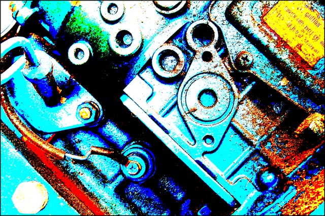
My intial impression here was YIKES thats bright hand me the sunglasses. Now all joking aside I think you lost a lot of character and charm in your processing. You do have the grain to meet the challenge but the colors are just to bold and become a complete distraction.
I wish the caution label would have actually been readable and again your colors seem to have taken charm from this tractor.
Anna |
|
 Photographer found comment helpful. Photographer found comment helpful. |
Comments Made During the Challenge  |
|
|
10/28/2005 11:22:07 PM |
| One of the better color entries I've seen. Your post-processing gives it an almost graphic-like quality. Bumping up after second look. |
|
| Photographer found comment helpful. |
|
|
10/26/2005 11:24:11 PM |
| This is a very strong image. I like that you were bold in your color selection. |
|
| Photographer found comment helpful. |
|
|
10/25/2005 10:53:23 PM |
| I like the unique colors created in this image. Very contemporary. |
|
| Photographer found comment helpful. |
|
|
10/25/2005 08:58:57 PM |
| Comong back for a second look and bumping up to an 8, extremely original. |
|
| Photographer found comment helpful. |
|
|
10/25/2005 08:35:20 AM |
| Extreme grain and noise along with extreme color processing. Interesting, and a cool visual abstract. |
|
| Photographer found comment helpful. |
|
|
10/24/2005 05:42:02 PM |
| This looks more a product of funky post processing than any real image grain. |
|
Home -
Challenges -
Community -
League -
Photos -
Cameras -
Lenses -
Learn -
Help -
Terms of Use -
Privacy -
Top ^
DPChallenge, and website content and design, Copyright © 2001-2025 Challenging Technologies, LLC.
All digital photo copyrights belong to the photographers and may not be used without permission.
Current Server Time: 03/17/2025 02:45:32 AM EDT.