| Author | Thread |
Comments Made During the Challenge  |
|
|
06/16/2003 11:33:19 PM |
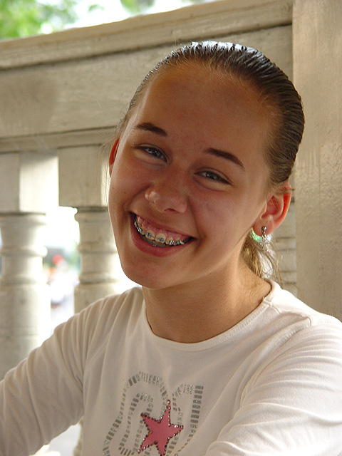
| Would have liked it more if some fill lighting was used on the face. Nice picture |
|
 Photographer found comment helpful. Photographer found comment helpful. |
|
|
06/16/2003 12:46:20 PM |
| nice portrait, good lighting, cute expression. |
|
| Photographer found comment helpful. |
|
|
06/15/2003 04:29:19 PM |
| Good portrait. I would have prefered a shallower DOF or different background but still a top photo - 9. |
|
| Photographer found comment helpful. |
|
|
06/14/2003 07:42:35 PM |
| Cute photo, nice model. Perhaps a little more fill lighting to add some brighter catchlights. |
|
| Photographer found comment helpful. |
|
|
06/14/2003 03:59:03 PM |
| Nice tonal range. Face might be a liiiiiitle too dark in that shadow, but otherwise great. |
|
| Photographer found comment helpful. |
|
|
06/13/2003 05:02:14 PM |
| Harsh exposure. Fair attempt. |
|
|
|
06/13/2003 02:11:08 PM |
| You have chosen a very nice setting. The wooden fence is the finishing touch in the photo. Your model would do well on the front of a magazine although I think that her face is a little underexposed. Maybe flash fill could improve this. |
|
| Photographer found comment helpful. |
|
|
06/13/2003 03:05:24 AM |
I think there is too much shadow on her face. Otherwise a good shot.
Crop seems to be ok.
Composition also ok. |
|
| Photographer found comment helpful. |
|
|
06/12/2003 04:14:03 PM |
| A nicely thought out pic. The title is very suitable and I like the background in this shot. |
|
| Photographer found comment helpful. |
|
|
06/11/2003 06:02:31 PM |
| I don't know the magazine but this seems about right for the title. There's space for a logo at top, that's a plus. A little harder would be cover copy because of the brightness of the light coming between the columns but it could be done. |
|
| Photographer found comment helpful. |
|
|
06/11/2003 10:45:12 AM |
| Really good, fresh, happy. Nice job. |
|
| Photographer found comment helpful. |
|
|
06/11/2003 03:32:17 AM |
|
Home -
Challenges -
Community -
League -
Photos -
Cameras -
Lenses -
Learn -
Help -
Terms of Use -
Privacy -
Top ^
DPChallenge, and website content and design, Copyright © 2001-2025 Challenging Technologies, LLC.
All digital photo copyrights belong to the photographers and may not be used without permission.
Current Server Time: 03/12/2025 08:36:25 AM EDT.