**** C R I T I Q U E C L U B C O M M E N T ****
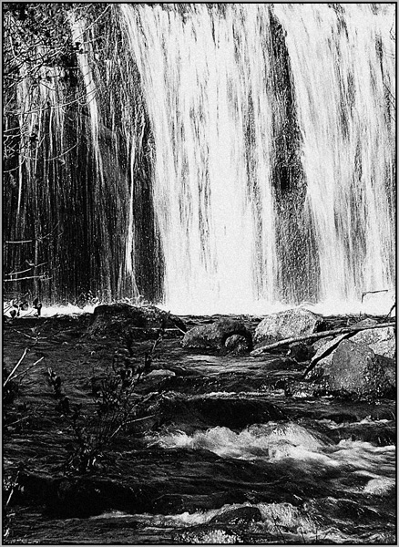
To deal with the grain first, I'm sort of neutral on it. Not a bad image for added grain, but it's not really adding a whole lot either. There's a vaguely "graphic" quality to it that's mildly appealing.
Compositionally, I find the image a little "uneasy". It's basically divided into 3 retangular sections: on the top, branches and waterfall, on the bottom stream-with-rocks. It's good that the "branches" component ends on a 1/3 line, roghly, and it's good that the water section is divided roughly on its own 1/3 line by the interruption in the flow.
But the foreground is out of balance with the upper components, taking more real estate than it seems to warrant visually. It's dark and heavy, and little of interest is there except some disturbances in the water. part of this is a contrast problem; were the image less contrasty then more detail throughout might have given us more to chew on in the foreground.
Of course, I realize the contrast is part of the search for grain, so...
All in all it's a pleasing enough image, I "enjoy" it up to a point, but it lacks any wow factor and it's compositionally ambivalent, so it doesn't make it to the next level, so to speak.
R. |