| Author | Thread |
Comments Made During the Challenge  |
|
|
10/25/2005 06:09:58 PM |
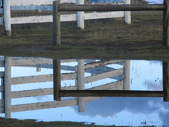
| i kind of like this. i like how the fence completes itself as a box...and the texture of the image makes it feel like a painting. |
|
|
|
10/22/2005 05:46:15 PM |
| in my opinion, the composition would be stronger if we could see the rest of the fences and a bit of the sky, as well. i would have cropped the bottom of it and increased the contrast and sharpness as well. |
|
|
|
10/20/2005 11:23:37 PM |
| This works well. I like the contrast between the two fences, captured in the water. Using a curves layer may have given it more of a pop. |
|
|
|
10/20/2005 03:16:04 PM |
|
|
|
10/19/2005 09:44:45 PM |
| Some interesting lines to work with here. I think I would have had the division line right in the middle, cropped the bottom tighter, and had more image at the top. |
|
|
|
10/19/2005 08:55:53 PM |
| Something about the lines that is almost throwing off my center of balance. I'd like some more color interest, or this possibly in a BW it may have not been so disconcerting... |
|
|
|
10/19/2005 04:03:09 PM |
| Technically good but dull colors |
|
|
|
10/19/2005 04:55:07 AM |
| very symetric! i also like the muted colors |
|
Home -
Challenges -
Community -
League -
Photos -
Cameras -
Lenses -
Learn -
Help -
Terms of Use -
Privacy -
Top ^
DPChallenge, and website content and design, Copyright © 2001-2025 Challenging Technologies, LLC.
All digital photo copyrights belong to the photographers and may not be used without permission.
Current Server Time: 03/12/2025 11:43:58 AM EDT.