Critique Club checking in.
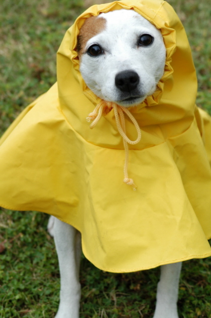
First thing that catched my eye is the pic does not look to be in focus. In any portrait the eyes should be in sharp focus, and here they do not appear that way to me. An aperture of 7.1 should provide enough depth of field, so i suspect a mild case of camera shake. You don't have the lens you use listed but from the bokeh behind the subject's head I suspect 100-150mm telephoto, and that is real hard to hold steady a 1/100 sec shutter speed. If I am wrong please let me know, as I am only guessing here and would like to know if, well, I know what I'm talking about ;) The image just does not look sharp.
The next thing that stands out is practically no catchlight in the eyes. Using a flash would add sparkle, add life to the portrait by adding a sharp bright catchlight in the eyes, assuming you can avoid the dreaded red-eye effect.
Lastly, technically speaking, the image lacks contrast. The colors are there, and the yellow and green work nicely together, but try a USM with an amount of 35%, radius 60 and thrushold of 1. Give or take a bit on the first two figures. It works as a 'haze' remover and should give hte image more 'pop'.
Compositionally speaking, the colors are good. The eyes seem a bit high in the image, above the 1/3 line. It pulls my eye away from most of the image. Since the raincoat goes outside the image on 3 sides, cropping the bottom tighter would have worked better. The legs are not an important part of the image so can be removed as they are more of a distraction than addition. This would have moved the eyes mroe toward the recomended rule of 1/3s location. I do like the head being off center just a tad, that works.
I hope this helps. Those photos that score in the middle can be tough to critique as they usually have no major flaws and often get few comments.
-chris |