| Author | Thread |
|
|
10/26/2005 08:56:13 AM |
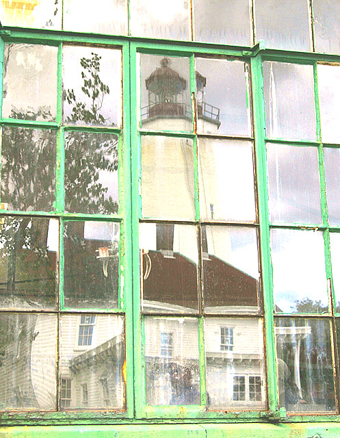
| Nancy, I again want to take the time to compliment you on this shot. Reviewing my comment below, the yellow splash of color is, of course, upper left; not what I wrote (I'd be dyslexic, if I weren't so backward to begin with....) Now that I have seen your portfolio, I admire this shot even more. Since you specialize in lighthouses, this was not a case of a passing shot of a random scene that struck you. It is a well thought out decision for an interpretation of something extremely meaningful to you; which, to me, is the essence of photography. I am becoming inactive on this site, but will pop back in from time to time to look at your work, among others. I feel your touch is that good. I shoot my first lighthouse in January. I hope I can convey its rusticity and sublime beauty the way you have done time after time. |
|
 Photographer found comment helpful. Photographer found comment helpful. |
|
|
10/26/2005 12:41:12 AM |
| Thank you all for the comments. The lighter high key color was intentional. I liked the look. For the lighthouse, I think it spoke more about its history this way. Judging from the comments & score spread, many like it & many don't....just a matter of taste. As a whole, I photograph to appeal to a select market, so it wont appeal to all. |
|
Comments Made During the Challenge  |
|
|
10/25/2005 08:28:37 PM |
| I love this photo! the way the panes of glass highlight the light house is perfect. an absolutely wonderful job. I hope this photo places high! |
|
| Photographer found comment helpful. |
|
|
10/25/2005 06:15:26 PM |
| from the title, i gather that you were going for a washed-out feel for the photo. i'm not so sure that it works for me...primarily because of the greens in the window frame. i do like the graininess of the photo, however. |
|
| Photographer found comment helpful. |
|
|
10/25/2005 09:00:09 AM |
| Great photo, great tones and tons of character. Keep up the good work! |
|
| Photographer found comment helpful. |
|
|
10/25/2005 03:10:37 AM |
| The rustic finish to the window perfectly compliments the reflection subject. Has the green been brightened - is it perhaps a shade too bright? Maybe not. Great chalky quality, though. I like it. |
|
| Photographer found comment helpful. |
|
|
10/23/2005 11:06:45 AM |
| Very nice. I like the vivid color to the window frame. the distortion given by the glass and the disjointed effect on the immage makes this. Great selection well executed. |
|
| Photographer found comment helpful. |
|
|
10/23/2005 11:05:31 AM |
| It's "ok" , I don't like the blown out green, would have been better IMO to use a faster shutter or a slower aperture. |
|
| Photographer found comment helpful. |
|
|
10/22/2005 06:06:34 PM |
| this looks too bright and blown out. |
|
| Photographer found comment helpful. |
|
|
10/21/2005 09:09:58 PM |
| Wow! Nice find! This is extraordinary in every way. The broken reflection ... the enigmatic splash of yellow upper right corner ... the tonal qualities of the reflected buildings that evoke the mood of bygone seasons and lives that have passed this way in time.... even the washed out shade of green... it all adds up to a perfect photograph. I don't give many, but you get a 10! My top pickfor this challenge. |
|
| Photographer found comment helpful. |
|
|
10/20/2005 04:07:08 PM |
| Something about this window I like...even though overall it's a bit washed out, the texture of the salt-water weathered glass is great. |
|
| Photographer found comment helpful. |
|
|
10/19/2005 05:09:31 PM |
| my highest voes so far very thoughtful looks like a painting |
|
| Photographer found comment helpful. |
Home -
Challenges -
Community -
League -
Photos -
Cameras -
Lenses -
Learn -
Help -
Terms of Use -
Privacy -
Top ^
DPChallenge, and website content and design, Copyright © 2001-2025 Challenging Technologies, LLC.
All digital photo copyrights belong to the photographers and may not be used without permission.
Current Server Time: 03/12/2025 02:34:04 PM EDT.