| Author | Thread |
|
|
10/27/2005 11:42:52 AM |
Hi everyone!
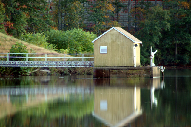
Alot of comments were made about the reflection being cut and how the photo should have been composed to show more of the house/reflection and less of everything else. I wish I could have made that work!! I needed to bring a weed wacker to cut down the overgrown weeds that were in the picture when I adjusted the compositon to be more like everyone suggested! Needless to say, I didn't have a weed wacker, so I had to alter the shot. There was alittle wind, so there is a tad bit of blur. Overall, thanks for all the comments. I am rather proud of this entry, especially since it is my first!
-=lee=- |
|
Comments Made During the Challenge  |
|
|
10/25/2005 06:15:08 PM |
| a tranquil photo. i wonder how this image could present more visual impact? |
|
 Photographer found comment helpful. Photographer found comment helpful. |
|
|
10/25/2005 04:27:09 PM |
|
| Photographer found comment helpful. |
|
|
10/25/2005 03:17:01 PM |
| This would have been nice if the image wasn't centered. I'd have taken it so that all of the shed would have been shown in the reflection. Didn't need so much on the top of the shot. |
|
| Photographer found comment helpful. |
|
|
10/24/2005 07:21:11 PM |
| Damn..why is the boathouse cut :( |
|
| Photographer found comment helpful. |
|
|
10/24/2005 02:05:21 PM |
| Nice picture. Great reflection but would love to see more of it. |
|
| Photographer found comment helpful. |
|
|
10/24/2005 03:09:47 AM |
1/5th of the frame (on the right) is distracting becouse it's empty. And the other 4/5 of
the image are very nice and pleasing to look at. I think that's your only mistake.
I would go a bit lower and to the left if it was my shot.
And maybe it's too blury. Camera shake or wind? well anyway, I'll vote high, I like it. |
|
| Photographer found comment helpful. |
|
|
10/23/2005 11:10:16 AM |
| looks like the house isn't quite focused |
|
| Photographer found comment helpful. |
|
|
10/21/2005 10:55:56 AM |
| More reflection, less block wall .... a 9. As is, a 7. Yes, it makes that much of a difference. My own general common sense rule of thumb as to which gets dominance in a water reflection shot - the actual subject or the reflection - hinges on which stirs the deeper emotions. In this case, the paintinglike water scene is so much more appealing than the reality of the concrete blocks. Also, including the tip of the building in the bottom of the frame would have completed the linear congruity many viewers want to find in order to "complete" the composition. |
|
| Photographer found comment helpful. |
|
|
10/20/2005 09:15:14 PM |
| very pretty and awesome...only it just doesn't have a very sharp feel :/ |
|
| Photographer found comment helpful. |
|
|
10/19/2005 09:47:46 AM |
| Nice concept and good colors..but the composition needs improvement ...the hut looks very static in the middle |
|
| Photographer found comment helpful. |
|
|
10/19/2005 07:31:48 AM |
| This image is quite spectacular. While there have been many reflections from water in this challenge the sense of serenity captured in this scene helps your image stand out from the rest in my opinion. I like it very much. |
|
| Photographer found comment helpful. |
|
|
10/19/2005 07:15:34 AM |
|
Home -
Challenges -
Community -
League -
Photos -
Cameras -
Lenses -
Learn -
Help -
Terms of Use -
Privacy -
Top ^
DPChallenge, and website content and design, Copyright © 2001-2025 Challenging Technologies, LLC.
All digital photo copyrights belong to the photographers and may not be used without permission.
Current Server Time: 03/12/2025 01:30:47 AM EDT.