| Author | Thread |
|
|
11/03/2005 11:42:05 PM |
Greetings from the Critique Club
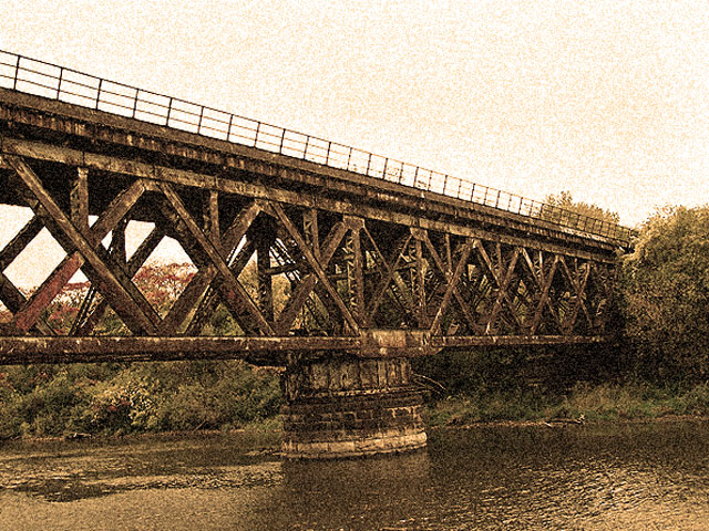
Very nice image strong lines, nice choice of tones. Excellent use of grain for effect.
I'm seeing one big issue here with the photo and it appears to be something very easy to correct. It looks like you have the Leaning Tower of Pisa here. The base of the bridge is on an angle and causes everything to appear leaning. You might want to try straightening that up and see what happens.
Overall though this is a very appealling bridge photo, nice take on the challenge.
Anna |
|
Comments Made During the Challenge  |
|
|
10/27/2005 05:50:53 PM |
| Very striking. I love bridge pictures, and this is nice and bold. The sepia adds a lot to it too. Good luck. |
|
 Photographer found comment helpful. Photographer found comment helpful. |
|
|
10/26/2005 11:28:15 PM |
| Nice bridge and focus over the water. The golden is a nice effect to the shot. |
|
| Photographer found comment helpful. |
|
|
10/25/2005 09:43:46 AM |
| Nice photo, lots of character in that bridge. The horizon seems a bit off. |
|
| Photographer found comment helpful. |
|
|
10/25/2005 08:35:52 AM |
|
| Photographer found comment helpful. |
|
|
10/25/2005 08:12:04 AM |
| Good idea, but the grain here looks more like noise than grain. Which I'm sure makes no sense. :) Hmmm, okay, better explination. The sky noise/grain stands out in a way that is visually unappealing. I'm thinking it's a color conversion issue. Possibly a different quadtone conversion would give the same impact....wait, just figured it out. There's a bit of a hint of the green in the sky noise. This makes it less grainy and more noisy...and you are still looking at me like I'm smoking crack. Sorry. :) 6 |
|
| Photographer found comment helpful. |
|
|
10/25/2005 07:15:48 AM |
the grain reminds me of foxing on an old postcard, effective.
the image seems tilted to the left judging by the river-band. |
|
| Photographer found comment helpful. |
Home -
Challenges -
Community -
League -
Photos -
Cameras -
Lenses -
Learn -
Help -
Terms of Use -
Privacy -
Top ^
DPChallenge, and website content and design, Copyright © 2001-2025 Challenging Technologies, LLC.
All digital photo copyrights belong to the photographers and may not be used without permission.
Current Server Time: 03/12/2025 03:12:13 PM EDT.