| Author | Thread |
|
|
11/04/2005 05:52:36 AM |
Hello from the Critique Club!
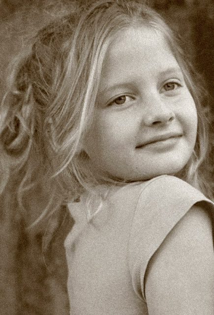
This is a nice image, with a very obvious grain. I like the look that you have chosen: the slightly sepia effect does age the image, though at the expense of achieving strong tonal range throughout the image. By this I mean that the blacks are not very black, and the whites are not very white. Having said that, the whole image is well exposed, and there are stronger blacks on some points of detail (eyes, mouth). I might be tempted to experiment with pushing the contrast a little higher.
Your subject has a very pretty expression and warmth about her. Great pose, with an obvious tension in the way you have framed her that elevates the image beyond a snap. Her t-shirt does not fit perfectly within the idea of an aged picture, as it is an anachronism! I would not recommend period dress (a little hackneyed), but perhaps something a little more timeless.
The Depth of Field that you have chosen has left your subject's left eye slightly out of focus. However, her shoulder is in focus. This makes me think that you might have needed to be a fraction further forwards at the focal length used, to move her face into focus at the expense of the less important shoulder. This is a minor criticism: you have, in any case, kept the eye nearer the viewer in focus and that is the more important of the two.
Great photo. Good luck with the next challenge!
|
|
Comments Made During the Challenge  |
|
|
10/29/2005 03:53:49 PM |
| Very nice portrait, love the look on her face. Unfortunatelly, the grain doesn't help this photo at all, it somehow just looks like Photoshop noise that's been added for no good reason (but you are not alone, there are quite a few good photos in this challenge that would look better without the "grain"). |
|
|
|
10/29/2005 11:13:04 AM |
| Oh yeah, the high shoulder portraits !! I feel she's too close to the edge on right and there is extra room on the left behind her, may be if she had some room on the right, it would look more balanced ? |
|
 Photographer found comment helpful. Photographer found comment helpful. |
|
|
10/28/2005 04:58:51 PM |
|
| Photographer found comment helpful. |
|
|
10/28/2005 05:51:36 AM |
| Nice portrait, perhaps a little more room on the right would have created a more balanced image. she looks a lttle squashed against that edge. |
|
|
|
10/28/2005 12:21:44 AM |
| Nice photo, could have been improved by her eyes looking at the camera |
|
|
|
10/26/2005 11:57:08 AM |
| When I see this it has that classic old look that I like in images. Well done. |
|
| Photographer found comment helpful. |
|
|
10/25/2005 08:59:58 PM |
| This has a very old world feel because of the sepia tones, lovely portrait, 8. |
|
| Photographer found comment helpful. |
|
|
10/25/2005 07:29:09 PM |
| This is a nice portrait. Something about it doesn;t quite fit 'old fasioned'. Maybe the cut of the sleeves or just that kids didn;t used to be this confident :-). I wonder what it would have looked like with the grain erased from the eyes. |
|
| Photographer found comment helpful. |
|
|
10/24/2005 04:10:07 PM |
| Very nice vintage look to this photo! The grain carries well and really enhances the shot. Nicely done. |
|
| Photographer found comment helpful. |
|
|
10/24/2005 12:10:00 AM |
|
| Photographer found comment helpful. |
Home -
Challenges -
Community -
League -
Photos -
Cameras -
Lenses -
Learn -
Help -
Terms of Use -
Privacy -
Top ^
DPChallenge, and website content and design, Copyright © 2001-2025 Challenging Technologies, LLC.
All digital photo copyrights belong to the photographers and may not be used without permission.
Current Server Time: 03/12/2025 08:38:28 AM EDT.