| Author | Thread |
|
|
11/05/2005 06:24:29 PM |
Greetings from the Critique Club
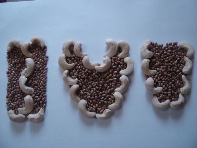
Artistic content here is good. Your idea has a lot of potential. Your biggest problem here is the background. So the real question is...Is it lighting issues or is it white balance. I actually think its a little of both, finding the right white balance will get rid of the blue and a little more light will help too.
Also on the subject of lighting watch out for the shadows they can really hurt you around here. try several light sources.
Final issue I see is your cropping...you needed to get rid of that upper left corner. That is such an easy fix so watch out for that.
Anna |
|
 Photographer found comment helpful. Photographer found comment helpful. |
Comments Made During the Challenge  |
|
|
11/01/2005 10:14:37 PM |
| poor crop job. b/g isn't white. |
|
|
|
10/31/2005 09:23:36 PM |
| This was a cute idea, but it should have been more evenly lit and cropped. The sliver of background in the upper left hand corner is a fatal flaw. |
|
|
|
10/28/2005 04:26:37 PM |
| For me, comes acress too dark for a "light on white" category. sorry. |
|
|
|
10/28/2005 12:42:17 AM |
| really should have cropped out the upper left hand, where the background edge is exposed. |
|
|
|
10/27/2005 08:25:30 PM |
| bit dark and could have done with being cropped as the edge of the background is showing top corner... |
|
|
|
10/27/2005 11:40:56 AM |
| Need a little better crop at the top - to get rid of the dark area in the upper left. |
|
|
|
10/26/2005 10:05:51 PM |
| There is a blue tint on the image making the background blue. Desat of blue might have helped. I also think the background should cover the entire frame and the edge is showing in the upper left corner. |
|
|
|
10/26/2005 06:36:36 PM |
| This does not meet the challenge. Take a photo in which the background is white and the subject is predominately a "light" color. |
|
|
|
10/26/2005 02:30:33 PM |
| very creative, but "white" background is way too blue, upper left corner is bad, better cropping may help this, but need to bleach out the blue in your white!! Also wish you had found something "light"er to use than those beans, but that is minor point! |
|
|
|
10/26/2005 10:13:02 AM |
| The crop could have been better - top left corner. A bump on the levels/contrast to bring out the white background more (it looks blue). A little more attention to detail and this would be a stronger entry. |
|
|
|
10/26/2005 12:52:56 AM |
| Nice idea, but looks like you didn't have enough time to edit it. Only 5 |
|
Home -
Challenges -
Community -
League -
Photos -
Cameras -
Lenses -
Learn -
Help -
Terms of Use -
Privacy -
Top ^
DPChallenge, and website content and design, Copyright © 2001-2025 Challenging Technologies, LLC.
All digital photo copyrights belong to the photographers and may not be used without permission.
Current Server Time: 03/13/2025 11:36:25 AM EDT.