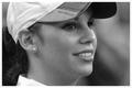
Took this photo in B/W to help with post processing.
Cloned out some imperfections (white tag from towel and a paint spot on the wall)
USM for grain
Gaussian Blur layer for grunge
Hue/Sat and Selective Color for Neutral colors adjustment
Spot editing for dodging, burning, and to bring out eyes and face
Resize
Added more noise to taste :)
USM
Save for web
Statistics
Place: 138 out of 274 Avg (all users): 5.2552 Avg (commenters): 6.2500 Avg (participants): 5.1382 Avg (non-participants): 5.4638 Views since voting: 861 Views during voting: 301 Votes: 192 Comments: 6 Favorites: 0
I saw you had posted this in the forums for critique also, let me check that thread before continuing since I'm sure you really don't need to hear the same things over, LOL :)
Well, between the forum posts and the notes here there really isn't much I can add. I like the overall idea, it's very good and would work well with a grainy image but the end effect seemed to have been lost in the post processing. If you take everyone's advice and redo this shot I would love to see it!
It achieves its mission, but I've learned that in most cases, brighter and happier images will score much higher than sad, dark images. Indeed, when I look at this photo I get sad, which isn't a fantastic emotion when you're scoring photos.
Don't get me wrong, it's great to make someone feel something, but if you're asking them to rate the photo on a scale of 1-10 then you want them happy when they do it.
That said, this challenge in particular almost demanded a dark and gritty image, and yours delivers. I didn't vote on this challenge, but this probably would have gotten a 5 or 6 from me. Why?
I don't like the "spotlight" effect around the girl. It seems to emote the opposite of the intended emotion, halos and "stepping into the light" make me think of hope, joy, etc.
The photo also lacks contrast. It's overall very flat. Maybe some light pants, or something. There's just so much wall and it is all the same grey which gets rather boring, and is very close to the "color" of her jeans.
It's not a bad picture, by any stretch, and a 5.2 isn't bad, but you probably would have gotten a 6 from me if there was more contrast, and maybe even a 7 if I really felt it.
Oh good one. The person looks like a captured cornered bird. The white of the socks and tee shirt help draw your eye to the corner. Well composed. Would make a cool album cover!