| Author | Thread |
|
|
11/03/2005 09:28:57 PM |
Greetings from the Critique Club
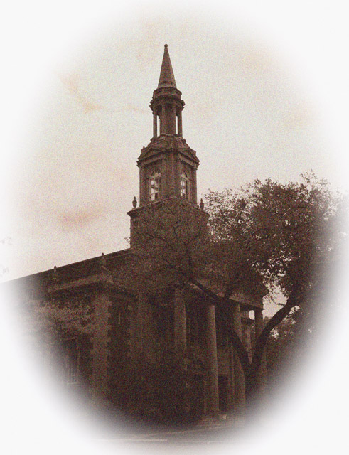
Where do I start on this. First I will say I like the overall composition of the photo and can see a few areas to improve in post processing.
Although you obviously were going for an aged appearance the pink in the sky is just not working.
As mentioned in the comments by someone else the border is too much. You lost to much of your work to your border and feathered edge.
You do seem to have photographed this church at just the right time of day. The structure is well defined and shadows a minimum.
As for meeting the challenge no question there it's obviously well met. Nice amount of grain for the look you were going for.
Overall I do like this photo its just the little minor things that would help.
Anna
|
|
 Photographer found comment helpful. Photographer found comment helpful. |
Comments Made During the Challenge  |
|
|
10/30/2005 05:46:58 PM |
| Another old postcard look. Nice job. |
|
| Photographer found comment helpful. |
|
|
10/27/2005 10:32:25 AM |
I don't really like the oval vignetting.
But that's just my opinion.
|
|
| Photographer found comment helpful. |
|
|
10/27/2005 08:55:25 AM |
| the border/framing is grabbing too much attention |
|
| Photographer found comment helpful. |
|
|
10/24/2005 03:05:57 AM |
| too much color noise in your grain, sorry |
|
| Photographer found comment helpful. |
Home -
Challenges -
Community -
League -
Photos -
Cameras -
Lenses -
Learn -
Help -
Terms of Use -
Privacy -
Top ^
DPChallenge, and website content and design, Copyright © 2001-2025 Challenging Technologies, LLC.
All digital photo copyrights belong to the photographers and may not be used without permission.
Current Server Time: 03/17/2025 09:54:22 AM EDT.