| Author | Thread |
|
|
11/03/2005 11:18:33 PM |
Greetings from the Critique Club
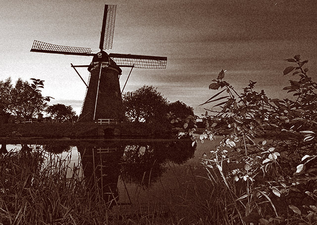
Very nice and appealling image. Definately fits the challenge well. I like the reflection of the wind mill in the water it adds a lot of warmth to the photo.
Your lighting appears to be a little off with the leaves in the right foreground being a little bright and an area behind the wind mill also seems overly exposed.
I am seeing a few "scratch like" marks on the right side, not sure what you have going on there but you might want to touch them up now that the challenge is over.
Anna
Message edited by author 2005-11-03 23:21:47. |
|
 Photographer found comment helpful. Photographer found comment helpful. |
Comments Made During the Challenge  |
|
|
10/30/2005 11:45:45 PM |
|
| Photographer found comment helpful. |
|
|
10/30/2005 11:45:40 PM |
|
| Photographer found comment helpful. |
|
|
10/30/2005 10:40:30 PM |
| A healing sight to settle the spirit. |
|
| Photographer found comment helpful. |
|
|
10/29/2005 12:28:40 PM |
|
| Photographer found comment helpful. |
|
|
10/25/2005 10:16:52 PM |
| Great photo, the only distraction for me is the bright brigt light on the bottom section of the plants in the foreground. You could try to minimize this by taking the color version and selectivly burning the midtones of the pedals using the burn tool. I'd also like to see a little more room at the top above the turbine blade. |
|
| Photographer found comment helpful. |
|
|
10/25/2005 12:19:06 AM |
| Very nice vintage look to this shot! The light on the leaves at the right of the pic is slightly distracting, but the windmill is very fetching! Good composition. |
|
| Photographer found comment helpful. |
|
|
10/24/2005 08:37:01 PM |
| Nice shot. Meets criteria of grain and visual interest. |
|
| Photographer found comment helpful. |
|
|
10/24/2005 06:32:10 PM |
| This shot has a lot of appeal with the deep DOF and the nice contrast; the grain is well done and suitable to the image. I do, however, feel that the sepia tone is a bit heavy, and it makes it difficult to really get the details.. they're just not standing out like they could with a slightly greener, less saturated tone. Otherwise, this looks great - I love the light. |
|
| Photographer found comment helpful. |
|
|
10/24/2005 09:46:57 AM |
| Very nice use of grain. Good use of a lot of key elements of photography here... good reflection, nice job getting down and getting a slightly different perspective, and thank you for having something in the foreground to add interest. Good use of rule of thirds as well. I like the sepia! |
|
| Photographer found comment helpful. |
|
|
10/24/2005 12:25:27 AM |
| wonderfull image it fits perfectly in the challenge. by the way, this looks very familiar |
|
| Photographer found comment helpful. |
Home -
Challenges -
Community -
League -
Photos -
Cameras -
Lenses -
Learn -
Help -
Terms of Use -
Privacy -
Top ^
DPChallenge, and website content and design, Copyright © 2001-2025 Challenging Technologies, LLC.
All digital photo copyrights belong to the photographers and may not be used without permission.
Current Server Time: 03/17/2025 06:20:54 AM EDT.