| Author | Thread |
|
|
11/03/2005 10:37:19 AM |
Hi there David and greetings from the "Critique Club"...
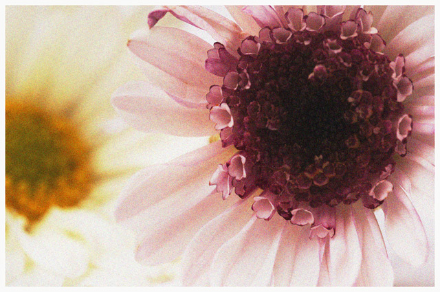
Ahhh...one of the images I commented one during the "grain" challenge. I still stand by what I mentioned in my previous comment...the grain completely enhances this image for me. Like bpickard, I am not a massive fan of the "flower" picture, to get my attention they must somehow be different, and for me "PotPourri" is just that. The color is delightful and the focus you chose is very effective. I enjoy the pink contrasted against the yellow, I find it very satisfying...delicious.
How might this image have scored higher? That I'm not sure about...perhaps the subject matter? Again...not sure. A few possible "nitpicks"...the longer I gaze at this the more I'd like to see a bit more detail in the center of that gorgeous pink flower, I know that there is some lovely texture there I am just not seeing. And perhaps a different crop? I also keep wanting to see a tad bit more room at the top of the image, that maybe the top of the pink flower is a bit clipped. I am hard pressed to find any other possible "flaws".
Overall this a very pleasing image, very soft and ethereal, actually something one might find on a greeting card, note paper, etc. I think for this particular challenge people were looking for a bit of "rough and tumble" and this image is a complete opposite of "tough". I hope I have offered a little insight/help. If you have any questions please do not hesitate to drop me a note. |
|
Comments Made During the Challenge  |
|
|
10/30/2005 11:16:38 AM |
| this is absolutely lovely nice color balance, framing and lighting. 9 |
|
|
|
10/30/2005 07:46:19 AM |
| one of my favorites this challenge -- well done on the color and composition |
|
|
|
10/29/2005 08:48:12 AM |
| Good flower pic...not often I say that so take it as a compliment! |
|
|
|
10/28/2005 11:01:08 PM |
| This is a nice photo. However, It leaves me wondering whether or not the grain really enhanced the image. To me, grain works best in photos that are dark, contrasty or moody, or to provide an "aged" look. This seems to me like a good image that had grain added to it for a contest, rather than an image that was enhanced by the use of grain. Keep shooting! :) |
|
|
|
10/25/2005 07:49:26 PM |
| Lovely colors! The image grain gives a nice dreamy feel to this shot. |
|
|
|
10/25/2005 06:22:20 AM |
| mmmmm flowers :o) i love that you used complimentary colors for this and went with the more delicate approach. I think the noise enhances the delicateness of this beautiful flower. good luck, hope to see ya at the top 10~~Cher~~ |
|
 Photographer found comment helpful. Photographer found comment helpful. |
|
|
10/24/2005 01:40:44 PM |
| Very nice use of color and composition. |
|
|
|
10/24/2005 12:33:20 PM |
|
|
|
10/24/2005 09:12:38 AM |
| I just love the color! I have to say that the grain actually makes this for me...I don't think I 'd find it as appealing without it...those pinks are yummy! Nicely done. |
|
|
|
10/24/2005 12:57:22 AM |
| This is lovely. I love the muted tones and the close up of the flowers. Great DOF. PLUS you aren't afraid to show some grain!!! |
|
Home -
Challenges -
Community -
League -
Photos -
Cameras -
Lenses -
Learn -
Help -
Terms of Use -
Privacy -
Top ^
DPChallenge, and website content and design, Copyright © 2001-2025 Challenging Technologies, LLC.
All digital photo copyrights belong to the photographers and may not be used without permission.
Current Server Time: 03/15/2025 01:48:32 AM EDT.