| Author | Thread |
|
|
11/03/2005 11:52:15 PM |
Greetings from the Critique Club
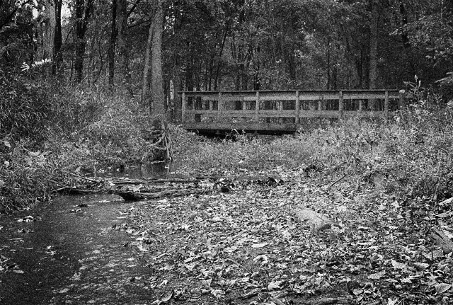
For starters you meet the challenge well there is a definate degree of graininess here. It's easily seen and you don't have to go looking for it.
As for improving this as others said its flat, and adjusting your contrast can help with that as well as a little change of lighting.
I do like the composition and placement of the bridge in your photo it makes it eye pleasing. Also adds some strong lines to your photo.
Anna |
|
 Photographer found comment helpful. Photographer found comment helpful. |
Comments Made During the Challenge  |
|
|
10/27/2005 09:36:57 PM |
| Seems a bit digitally broken up. By creating grain, the resolution was compromised, so the image itself may not have been the best choice for a photo using image grain. |
|
| Photographer found comment helpful. |
|
|
10/27/2005 01:34:55 AM |
| This really looks like it could be a wicked photo. It really from first glance reminded me of that movie Last House on The Left. |
|
| Photographer found comment helpful. |
|
|
10/26/2005 08:43:03 PM |
more contrast please, and if I may...
what was it that drew you to this photo? to me it's the bridge - but the visual noise from the leaves in front of it - coupled with the fact that the leaves are lighter than the bridge or it's background draws my eye to the leaves.
I would recommend cropping the leaves right out of there. I think of it as "visually simplifying" my photos - making it easy for my audience to see the main subject of what I was seeing, the cool part of what I thought was cool.
So that log in the stream would be the bottom of my photo if this were mine - not that I"m right, but that's what I prefer.
Once I had it cropped, I would add some more contrast, and dodge those midtones on the bridge to lighten them, drawing the eye of my viewer to what I thought was cool.
Now, if you have time, rummage around my portfolio and see if I've lived to my own standard - feel free to let me know where I could do better - or if you think I'm full of brown substance. I'm trying to be helpful, please take it in that spirit. :-)
I would love to walk into your photo BTW. 4 |
|
| Photographer found comment helpful. |
|
|
10/26/2005 03:25:16 PM |
| I think that this image would benefit by a little contrast. It's a bit flat. |
|
| Photographer found comment helpful. |
Home -
Challenges -
Community -
League -
Photos -
Cameras -
Lenses -
Learn -
Help -
Terms of Use -
Privacy -
Top ^
DPChallenge, and website content and design, Copyright © 2001-2025 Challenging Technologies, LLC.
All digital photo copyrights belong to the photographers and may not be used without permission.
Current Server Time: 03/17/2025 02:43:08 AM EDT.