| Author | Thread |
|
|
06/01/2006 01:36:20 PM |
| very nice work, compliments. |
|
|
|
11/07/2005 11:39:42 AM |
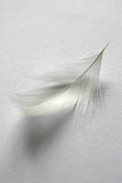
*Greetings from the Critique Club*
First let me say that I think this shot met the Light on White II Challenge very well (as evidenced from its 48th place finish and 5.6+ score). As your first challenge entry, I think it's outstanding (you shoulda seen mine - lol!).
Composition
I think this is probably where your score suffered the most. I notice that several commenters mentioned the "centered" composition and the lack of "rule of thirds". I think if you had cropped this differently, so as to use more negative space (along the rule of thirds), this probably would have scored much higher still.
Lighting
Very good. Light/White on white is NOT an easy thing to do and you managed to maintain nice soft tones without blowing any highlights. Good job. A few people mentioned the shadow and their personal preferences - as for me, I like it because I think it adds depth.
Focus/DOF
Very good also. You managed to achieve strong focus and a pleasant DOF without going overboard. Very appealing to the eye and really brings out the textures in the shot.
Overall
Great job. I think this was a very strong entry in the challenge and certainly one I'd be proud to have in my portfolio. And without any additional shots in your profile/portfolio for me to base your experience on, it's difficult for me to determine whether you're already familiar with the rule of thirds or not (the level of expertise on this site as you know is quite varied). It's a fantastic start for you here on DPC and I look forward to seeing more of your work!
Just my 2 cents...
Jimmy |
|
Comments Made During the Challenge  |
|
|
11/01/2005 05:28:45 PM |
| if the feather were floating in air, this would be my pick for #1 |
|
|
|
11/01/2005 10:55:38 AM |
|
|
|
10/31/2005 03:53:38 PM |
| I love the texture and detail. |
|
|
|
10/30/2005 05:44:26 AM |
|
|
|
10/30/2005 12:44:44 AM |
| i think this would be a better shot if the focus was deeper and the background wasn't so textures. nice idea |
|
|
|
10/29/2005 09:31:42 AM |
| Great focus and detail. I like the shadowing below the feather. It seems a bit too centered to my eye. I am a big fan of more negative space on one side, utilizing the rule of thirds.. |
|
|
|
10/27/2005 09:11:00 PM |
| Nice! the shoddow takes away dramaticly, but i am impressed with the clarity you got off this macro!! you must have manual focused! good job! |
|
|
|
10/27/2005 06:09:57 PM |
So, it comes 'down' to this.... (sorry)
Good lighting, good comp = good score |
|
|
|
10/27/2005 11:38:49 AM |
| feather shows a little oof on left side, nice otherwise |
|
|
|
10/26/2005 08:24:33 PM |
| beautiful, elegant and delicate |
|
|
|
10/26/2005 07:14:11 PM |
| The subject is centered. I think a different placement would have made the composition a little more pleasing. |
|
|
|
10/26/2005 03:13:10 PM |
| I think the composition would have been better if the feather was closer to the bottom and there was more white at the top. |
|
Home -
Challenges -
Community -
League -
Photos -
Cameras -
Lenses -
Learn -
Help -
Terms of Use -
Privacy -
Top ^
DPChallenge, and website content and design, Copyright © 2001-2025 Challenging Technologies, LLC.
All digital photo copyrights belong to the photographers and may not be used without permission.
Current Server Time: 03/12/2025 09:53:58 AM EDT.