| Author | Thread |
|
|
11/06/2005 01:18:13 PM |
Greetings from the Critique Club!
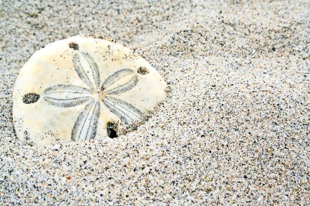
An image of a sand dollar in the sand. The subject is appealing to me, I've always liked sand dollars!
The composition of the image follows the rule of thirds by placing the subject off center and higher in the frame. In a simple composition placement is critical--it might have been ever so slightly stronger if the center of the sand dollar fell on the intersection of the imaginary thirds lines.
The depth of field is limited, throwing the background out of focus helps bring the eye forward to the subject. There is a great deal of interest in the sand grains--lots of texture and color to look at--but the sand provides little contrast to the subject.
The lighting is flat (as you note). Using a small reflector or flashlight to provide directional lighting might help bring out the detail in your subject, especially needed in the finely etched lines of the sand dollar's star. The far rim of the sand dollar appears to lose its crispness due to these lighting conditions and the fall off of focus at that point.
I keep trying to decide what the image "says" to me. It has a scientific title but isn't a specimin shot since the item is not whole nor, alternatively, is there a lot of environmental context...so that's not it. I suppose, in the end, it says "here is a sand dollar." I think somehow an image needs to help the viewer understand what is special about its subject--what's so special about this sand dollar--or what's so appealing about sand dollars in general? In other words, why do I want to keep looking at this?
Overall a good attempt to portray a favored subject.
Keep shooting!
--Kadi |
|
Comments Made During the Challenge  |
|
|
10/29/2005 10:10:18 AM |
| I like it when the greek names are used. It gives the subject such a sense of importance. I love the grain of the sand and the varying colors, but it isn't white. It was my understanding the the background was to be white and the subject light. ;~( |
|
|
|
10/29/2005 01:05:28 AM |
| I love the simplicity and positioning of this composition. Like the coloration, too. |
|
|
|
10/28/2005 08:46:56 AM |
|
|
|
10/27/2005 03:09:16 PM |
| nice capture, but the sand is NOT white enough to be scored higher IMO |
|
|
|
10/27/2005 02:57:50 PM |
| I like this, but unfortunately the background is not white. |
|
|
|
10/26/2005 01:16:31 AM |
| Not sure if people will find this to be white enough, but I love it. 10 |
|
Home -
Challenges -
Community -
League -
Photos -
Cameras -
Lenses -
Learn -
Help -
Terms of Use -
Privacy -
Top ^
DPChallenge, and website content and design, Copyright © 2001-2025 Challenging Technologies, LLC.
All digital photo copyrights belong to the photographers and may not be used without permission.
Current Server Time: 03/12/2025 03:10:51 PM EDT.