| Author | Thread |
|
|
11/05/2005 05:59:21 PM |
Greetings from the Critique Club
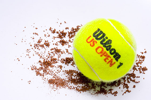
Nice image overall excellent dof and really nice detail. Lighting is just slightly off with a shadow in front and a slight bit of over exposure to the back of it.
Only thing I can see here that hurt you was the ball was probably considered to bright for light on white. Most were looking for white on white or soft pastel shades.
Honestly this is a good composition and its a shame it didn't score better.
Anna |
|
Comments Made During the Challenge  |
|
|
10/27/2005 04:32:50 PM |
For light on white, this certainly is bright.
Good comp, good exposure.....extra credit for playing on clay court. |
|
|
|
10/27/2005 03:54:24 PM |
| Really cool. The neon color is great and I love how you added the dirt. |
|
|
|
10/27/2005 06:44:42 AM |
| I'm still debating it - but the name brand sticks in my face a bit too much and thus detracts a bit from the image. So I wonder if it might look better if it was not so centered or could not be seen. |
|
Home -
Challenges -
Community -
League -
Photos -
Cameras -
Lenses -
Learn -
Help -
Terms of Use -
Privacy -
Top ^
DPChallenge, and website content and design, Copyright © 2001-2025 Challenging Technologies, LLC.
All digital photo copyrights belong to the photographers and may not be used without permission.
Current Server Time: 04/10/2025 08:46:38 PM EDT.