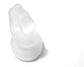
honesty here. It's a sculpture. Traditionally, they score very low on this site. People don't like seeing pictures of other people's art. I can't explain it, that's just the way it is.
Okey dokey - since you asked, mind you, I'll give you some honest feedback.
While technically well done, the focal point is hard to make out at first or even second glance. Using the title as a clue helps, but it just feels like I have to work too hard to figure this one out. Even knowing it's supposed to be a kiss - I just don't see a kiss here. Once I have figured it out, there isn't enough here (IMHO) to keep me interested, and because of this, the image does not have the apparent intended emotive effect (at least for me). I don't think the shot conveys the title, because I can't see the second face. It doesn't really look a first kiss, or even any kiss, and this is because you can't see a face on the right. This is a case where a different composition may have added to visual impact. A full 1/3 of your frame is the back of a head; would you have done that with real people?
So, on technicals - yes, well done. On emotive aspect - not as well done. I can see where you are going, but I'm not sure you got there. Overall impact - rather nice, but lacking "wow" factor. Meets challenge - yes, but not as well as some of the other entries.
I didn't vote on this image, but if I had I probably would have given this a 4. I would have pondered a 3 because the image does not appeal to me, and then pondered a 5 because it is well shot, but in the end I would have likely settled in the middle.
Certainly don't mean to hurt your feelings, I see that you have other great shots in your portfolio. It's just that I don't see this particular one in the same way that you did.
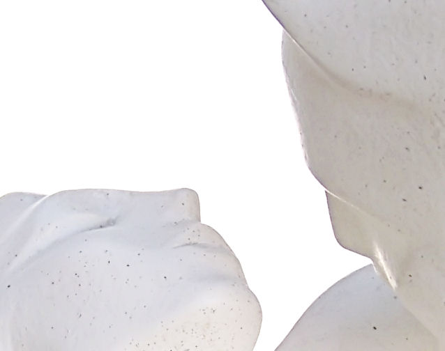
Technical Merrit: Exposure is right on! You have the highlight detail in all the right places. Focus: Good, not quite tack sharp, but then again, not many pics are.
Composition: Good use of negative space helps draw your eyes to the subject. However, crop feels too close. I would like to see more.
Interest: Can't quite put my finger on it, but something keeps me looking at it. Keeping that in mind, I can't help but want to see more, the crop is just too tight for me.
The way I look at scoring.
1-2 - Technically flawed, composition weak, should consider reshooting.
If you fall in this category it is taste that will determine a
1 or 2.
3-4 - Composition ok, but has an unforgivable technical error (out of
focus) or Technically ok but composition is weak.
5-6 - A technically good and compositionally pleasing shot,
with a noticable, but fixable, error.
7-9 - Technical and compositional excellence; it's all about taste at
this stage.
10 - Technically and compositionally superior! This image has
that X-Factor.
I would score this a 5.5 (meaning I think that an overall average should be a 5.5 when all voting is complete), since I can't vote a
5.5 I would given this pic a 6. I can't quite get past the tight crop, but, I think that is easily fixable! Thus, 6.
Why it scored below 5; I would venture and say the tight crop is
the culprit here.
Technically this is well done. I think that's important as this was a technical challenge and the subject, to me, isn't quite as importnat. You weren't scared to have some blacks in and didn't lighten them grays (like many did). Highlights are maintained well and the background (which I'm assuming is sky) is nice and uniform. Could your position have been just slightly changed so as to make the face on the right a little more "facelike" and a little less abstract. We know what it is, but the difference in recognizability between the face on the right and the one on the left drives the intimate figures apart instead of together. I didn't vote this challenge, but I'd give it a 7.